Catalogues and posters
Moorpark College Health Center
Series of three posters created for the Moorpark College Health Center. The concept was to find a way to represent the idea of congestion when you drink too much soda and get bloated. The white space united the elements of blue and black. The black gave a very dark yet super congestive feeling while the blue gave it a very bubbly and airy feel. The YOG figure gives the feeling of a person floating in space above what could be like a watery substance. Using the font Helvetica Neue, I wanted to represent the feeling of things being cluttered and being bubbly. I used mostly a,e,o because that is the noise I feel comes out when I am congested. The blues were added to give a calming feel and is what I imagine is in my stomach. I expanded my series to include common problems such as allergies and gas.


Thoughts on Type
Case Study of converting an online article into print format.


ViacomCBS Global Distribution Formats Catalogue
Example of Catalogue created from an excel sheet. The goal was for the internal pages to be contained in their own mini booklets (Drama, comedy, and non-scripted) to be handed out individually or as a whole at international markets.


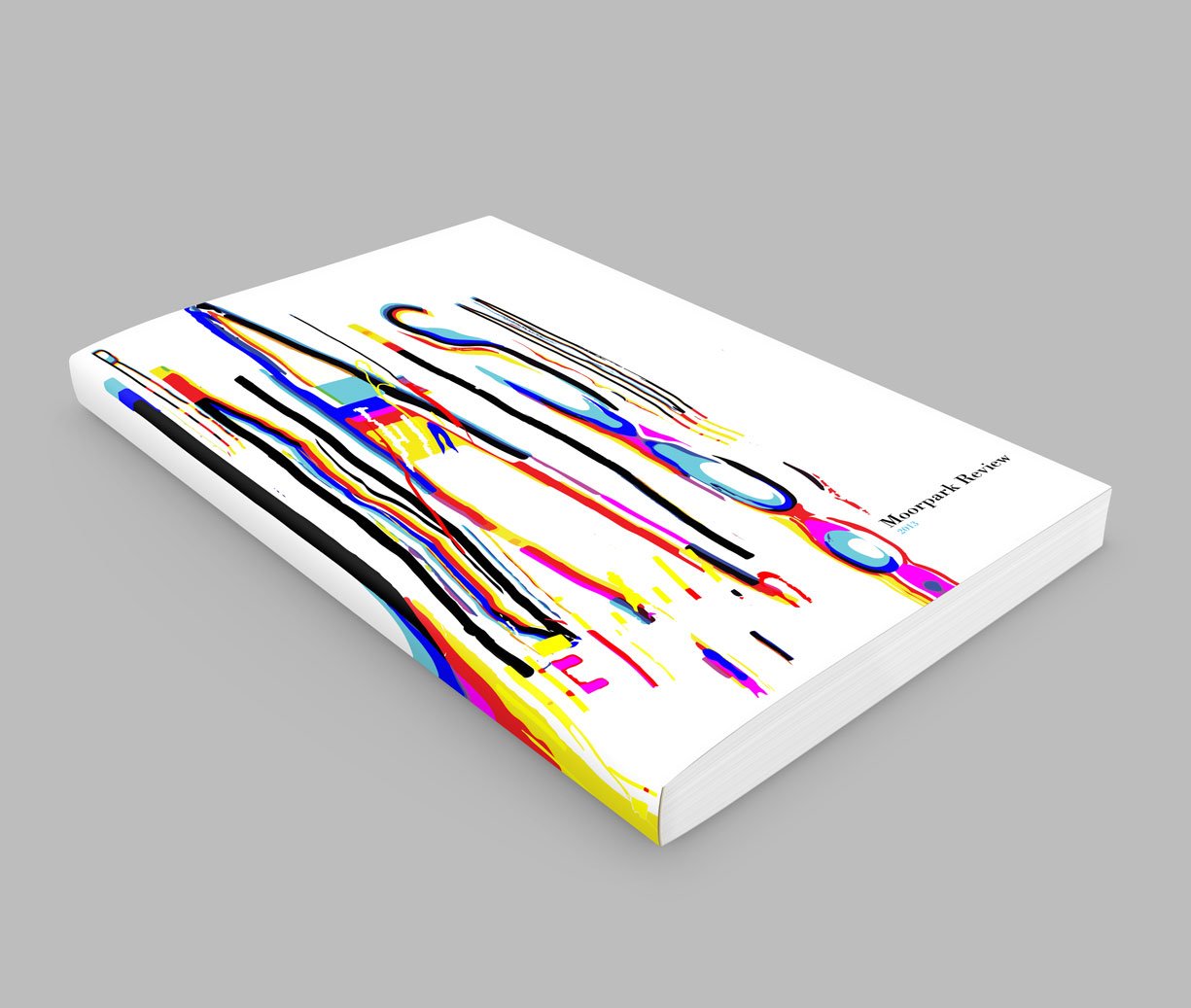
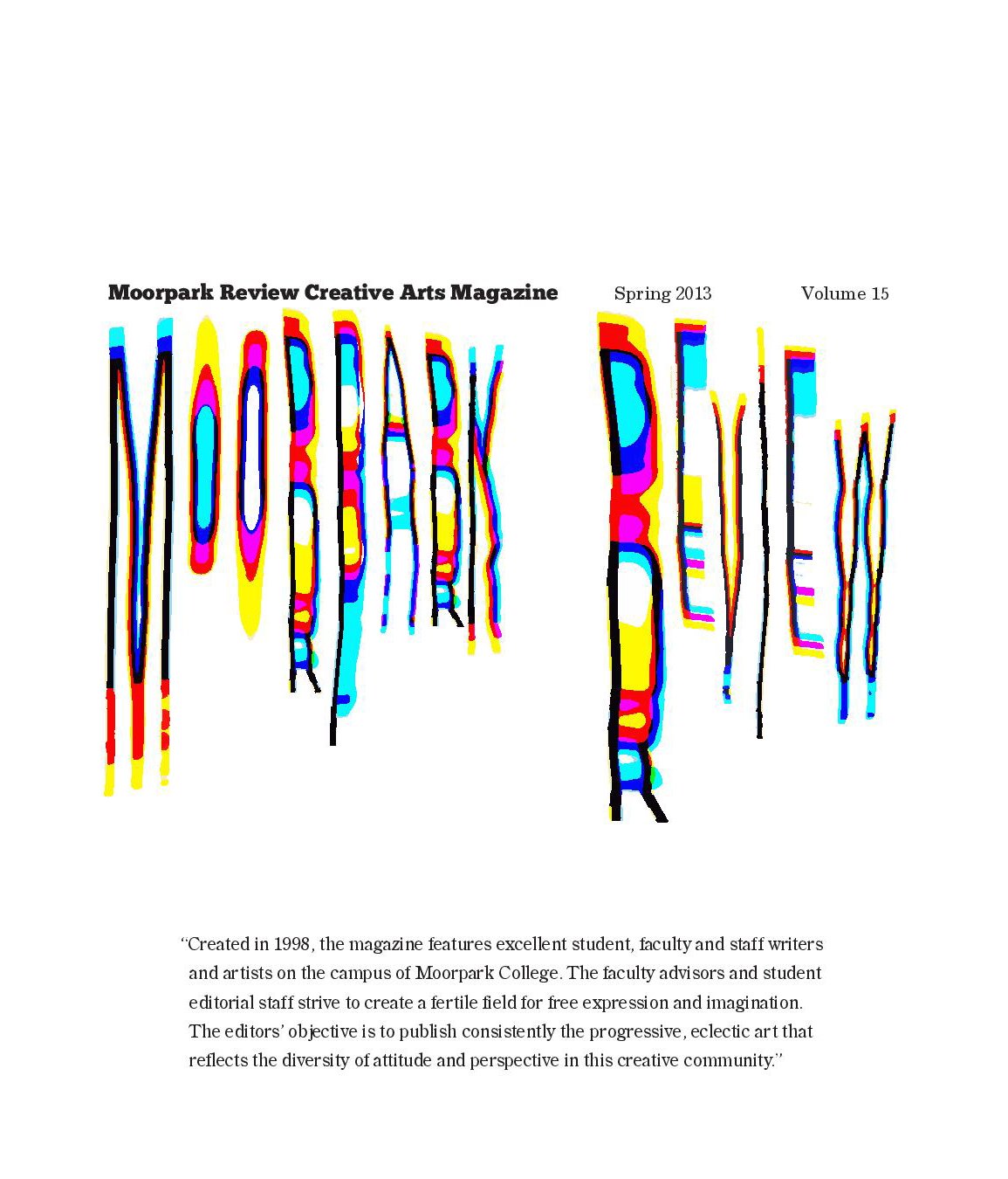
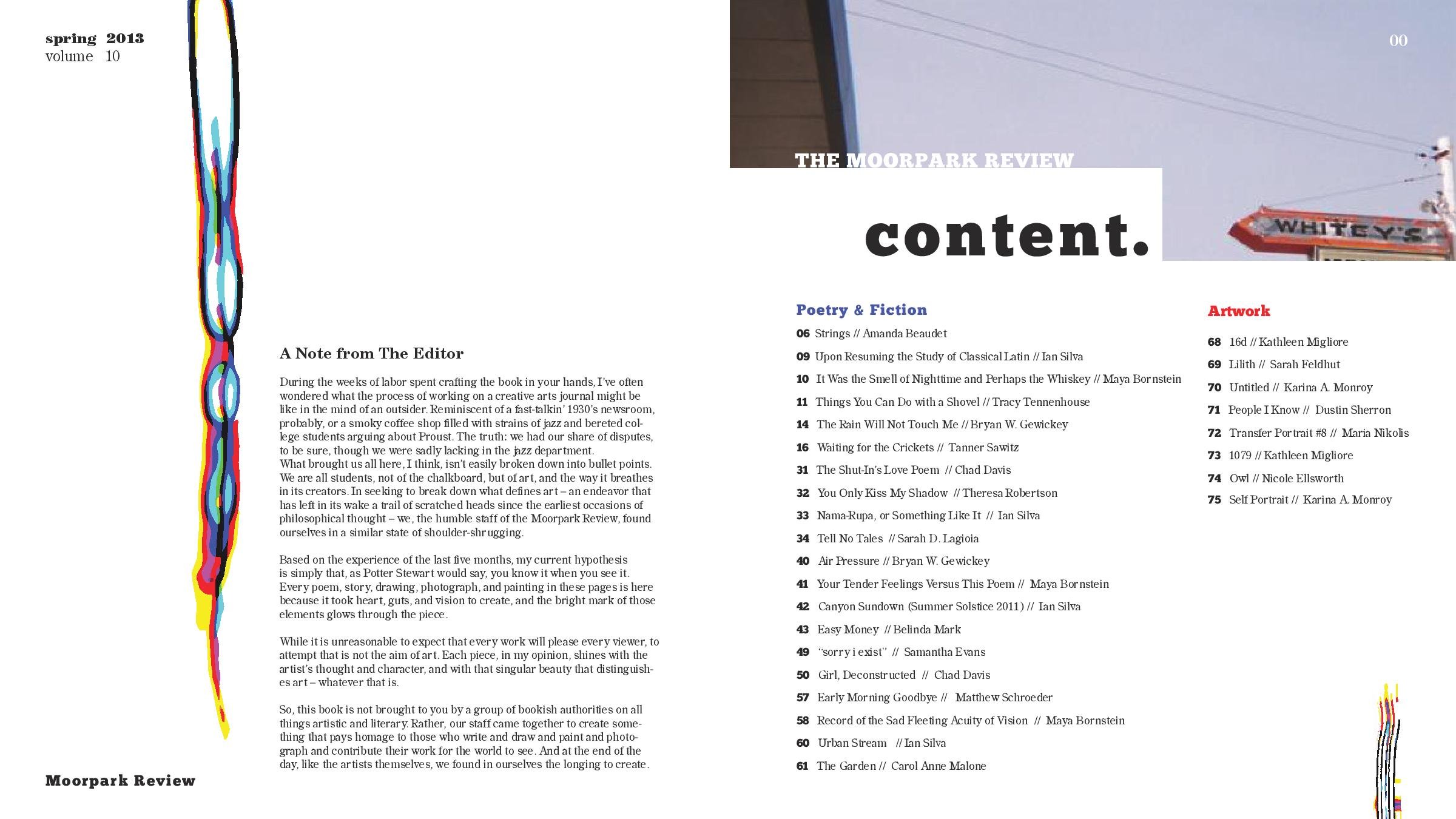
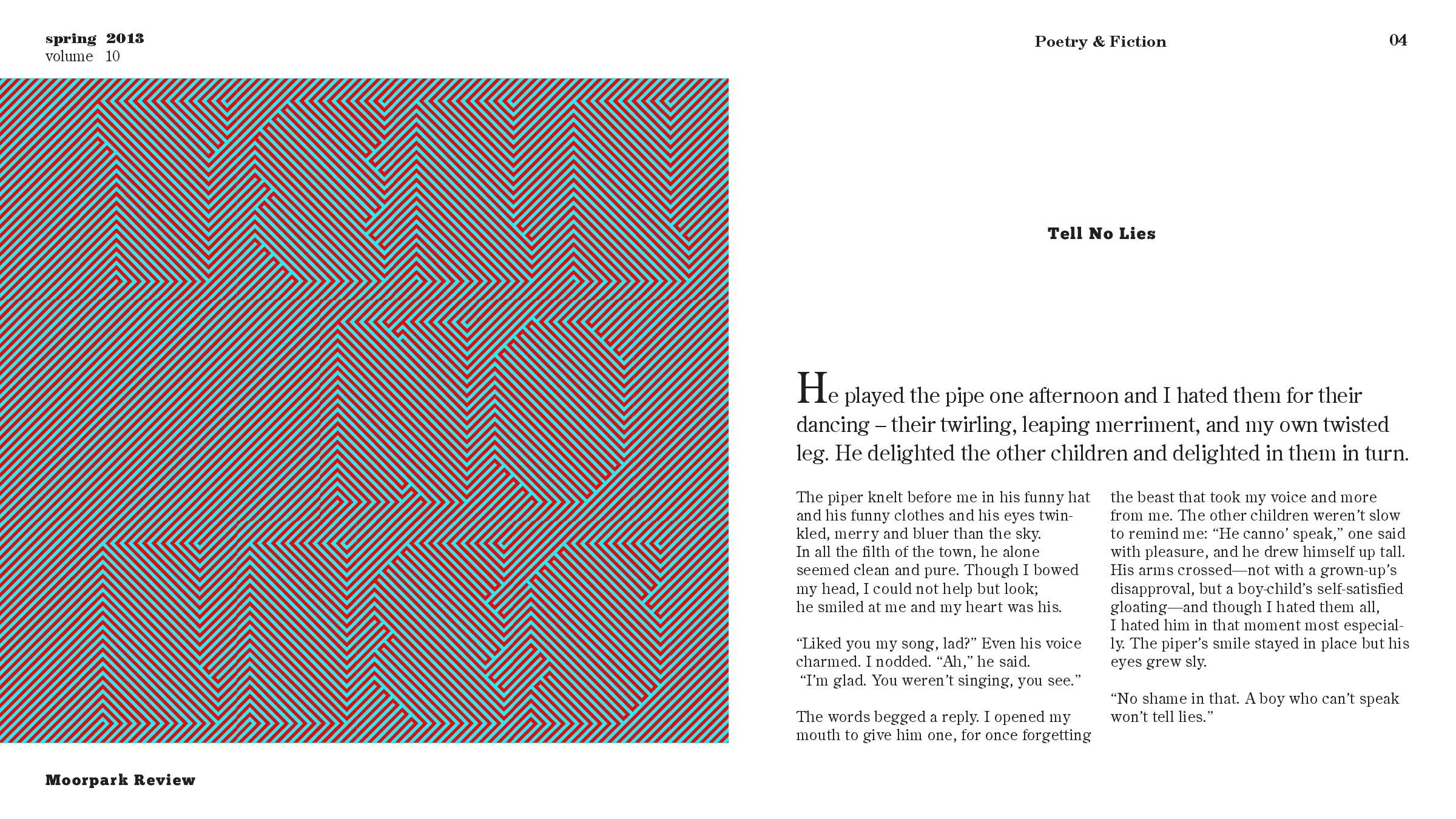
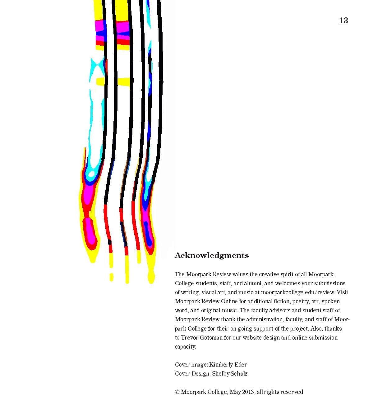
Moorpark Review
Created in 1998, Moorpark Review features excellent student, faculty and staff writers and artists on the campus of Moorpark College. The faculty advisors and student editorial staff strive to create a fertile field for free expression and imagination. The editors' objective is to publish consistently the progressive, eclectic art that reflects the diversity of attitude and perspective in this creative community. In 2013, I was given the opportunity to redesign their magazine. I wanted to convey a Neville Brody feel because life is about breaking the rules.