Art Direction
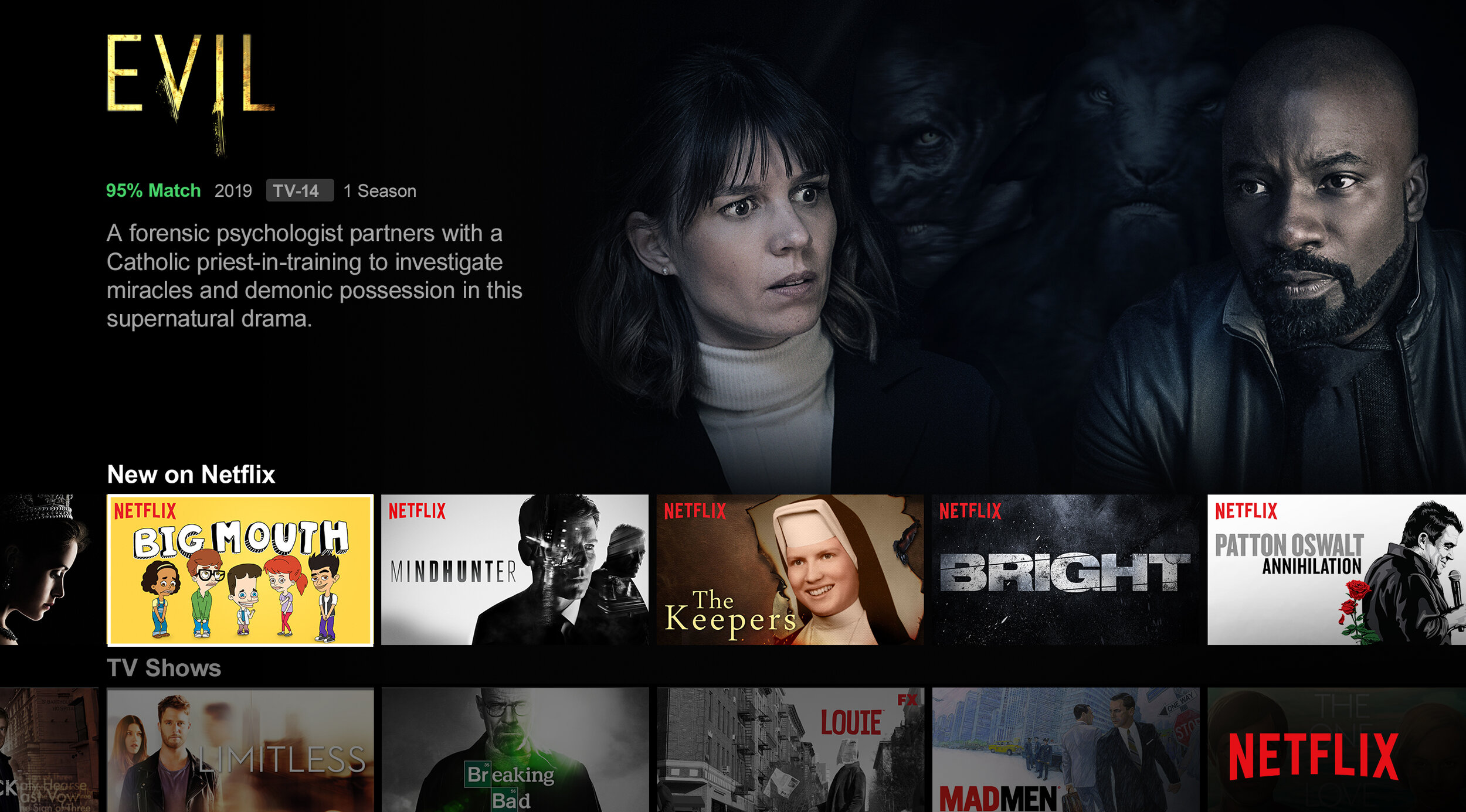
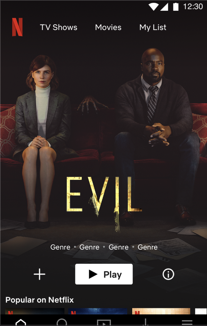
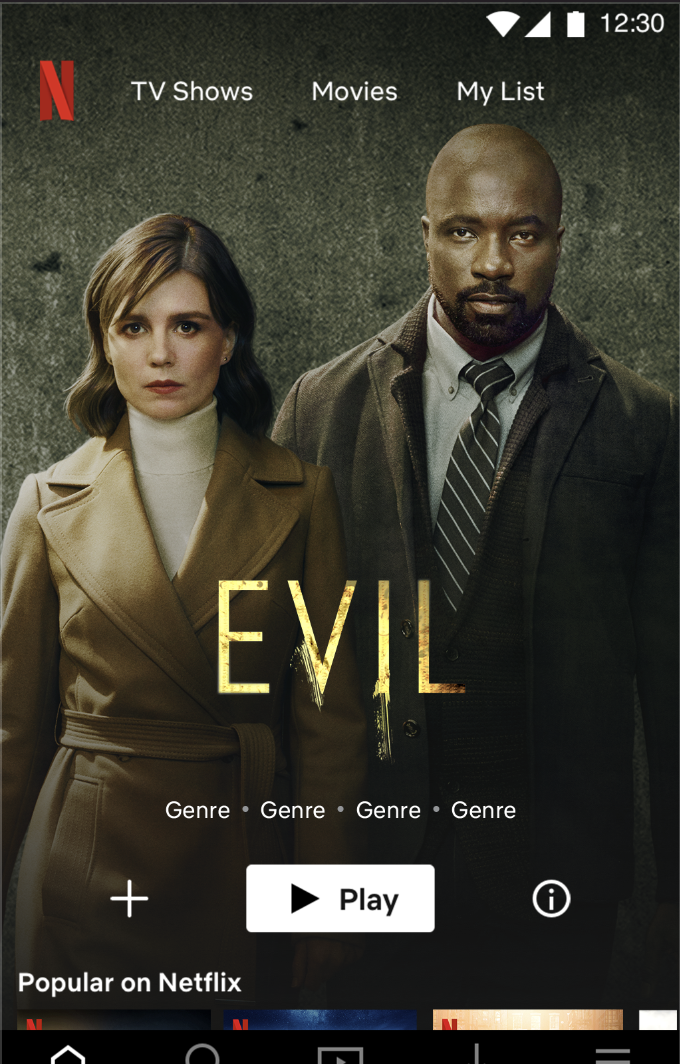
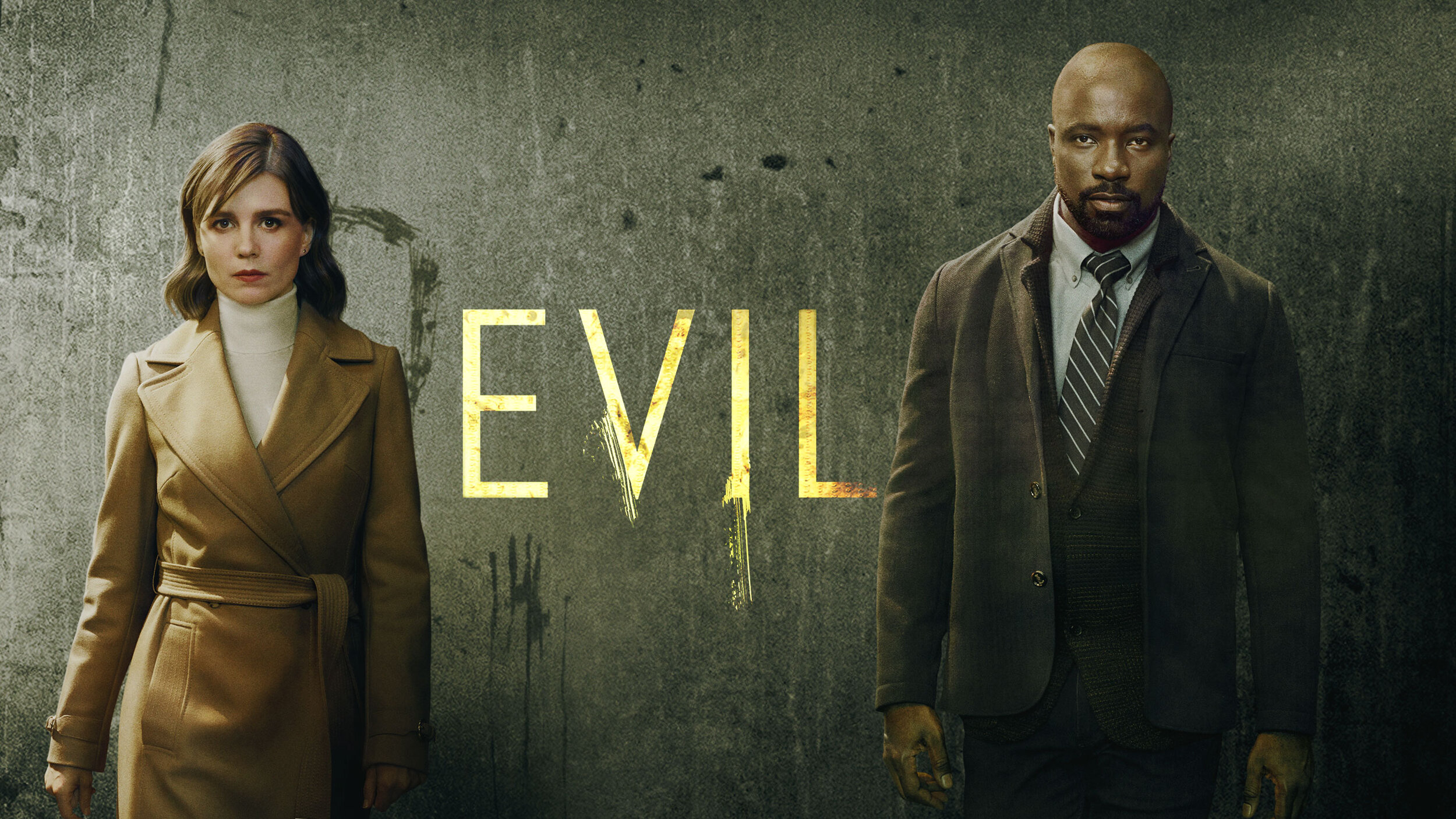
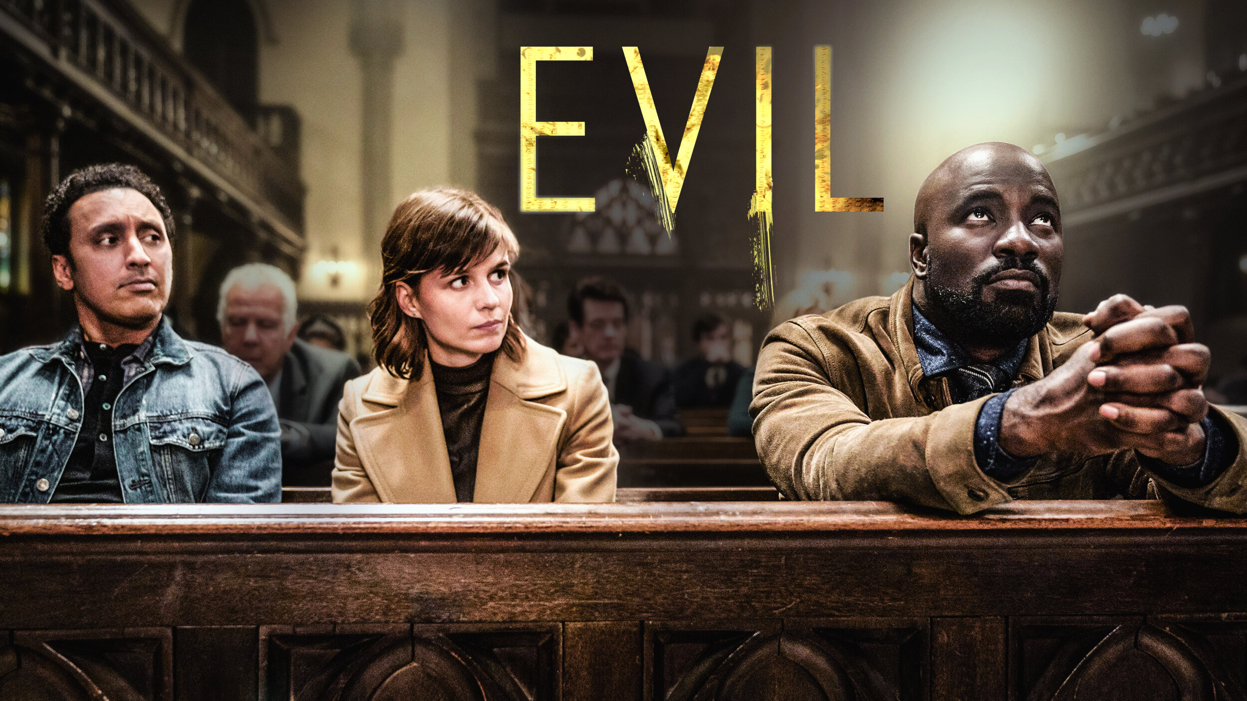
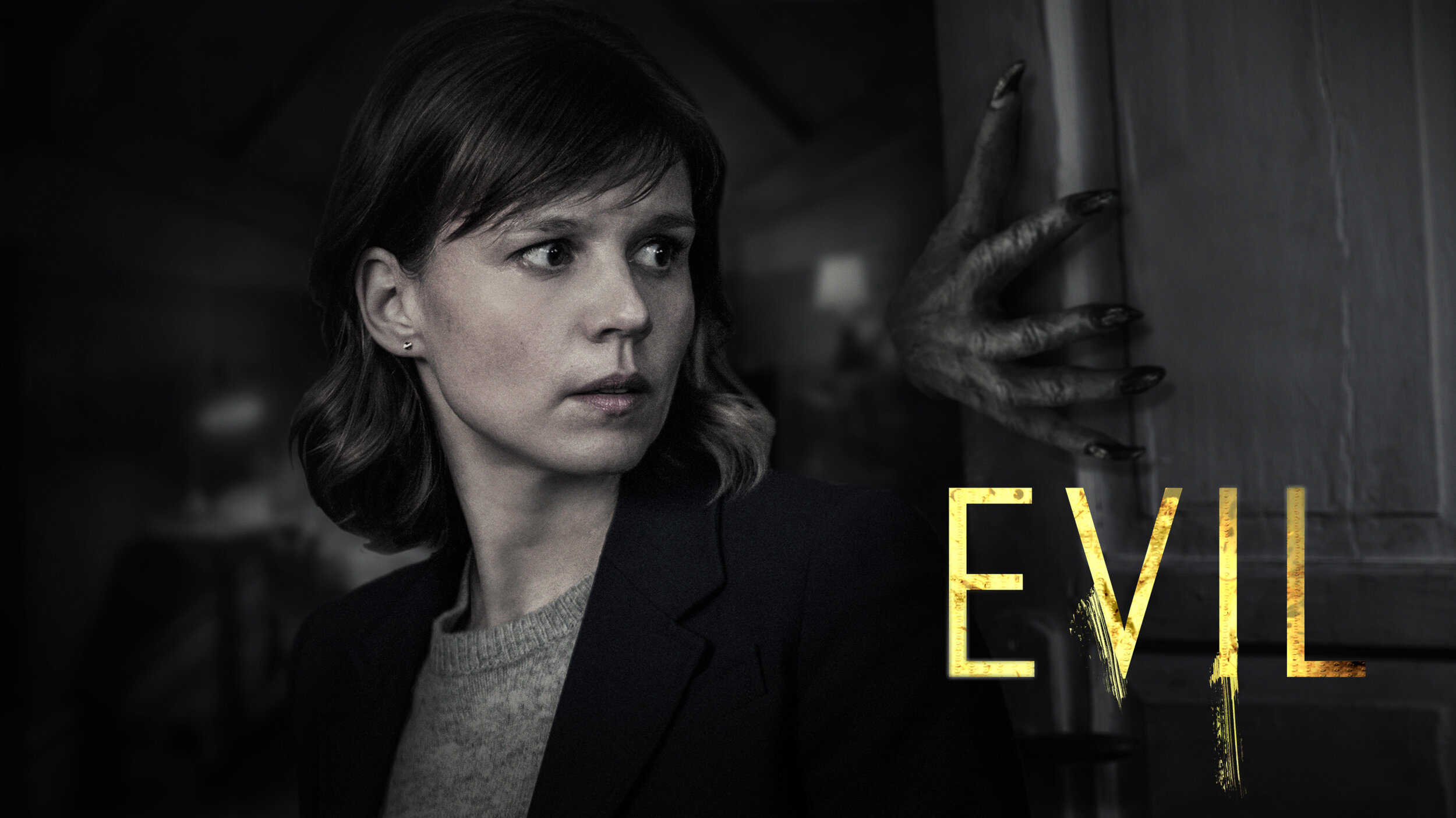
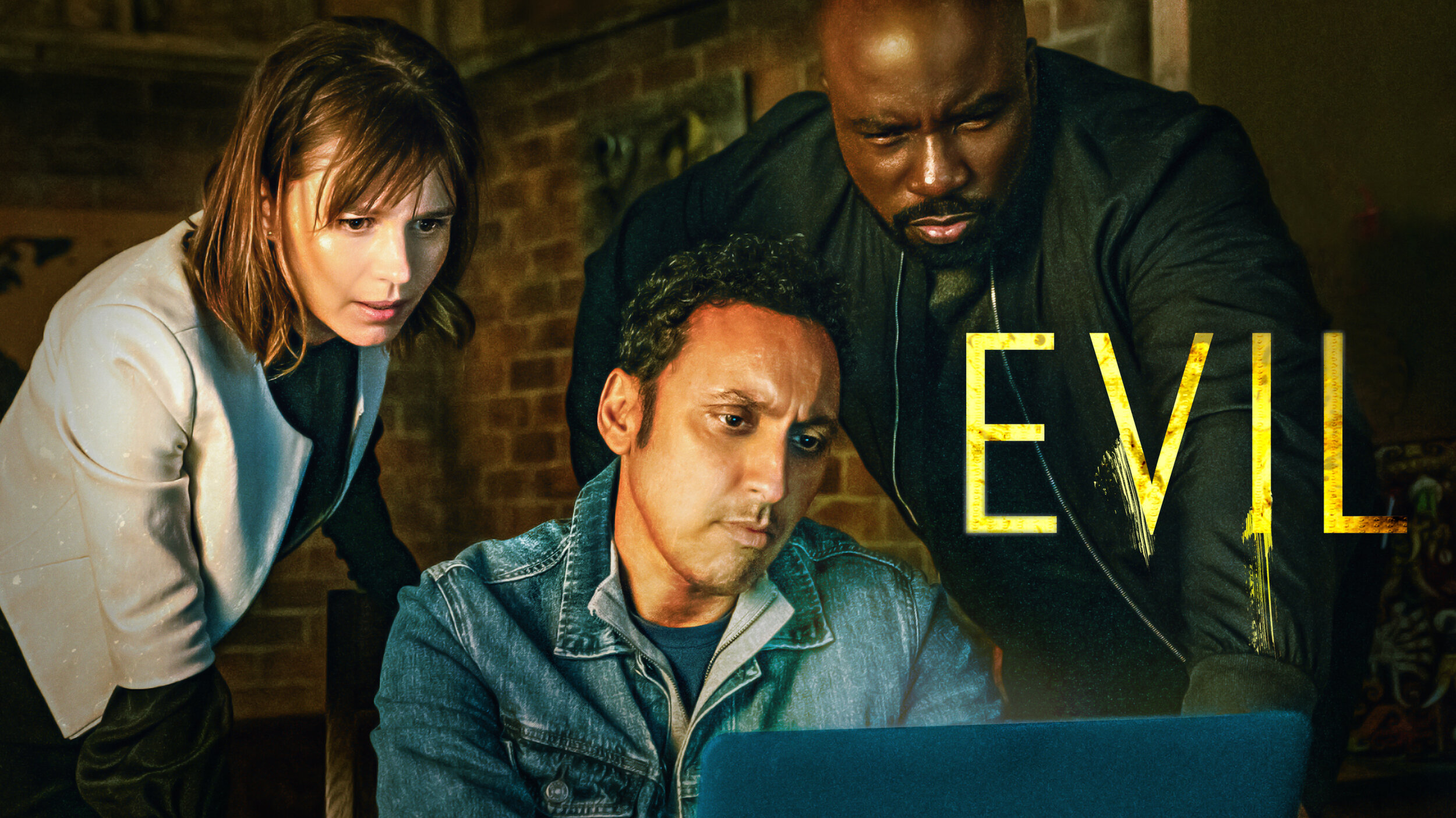
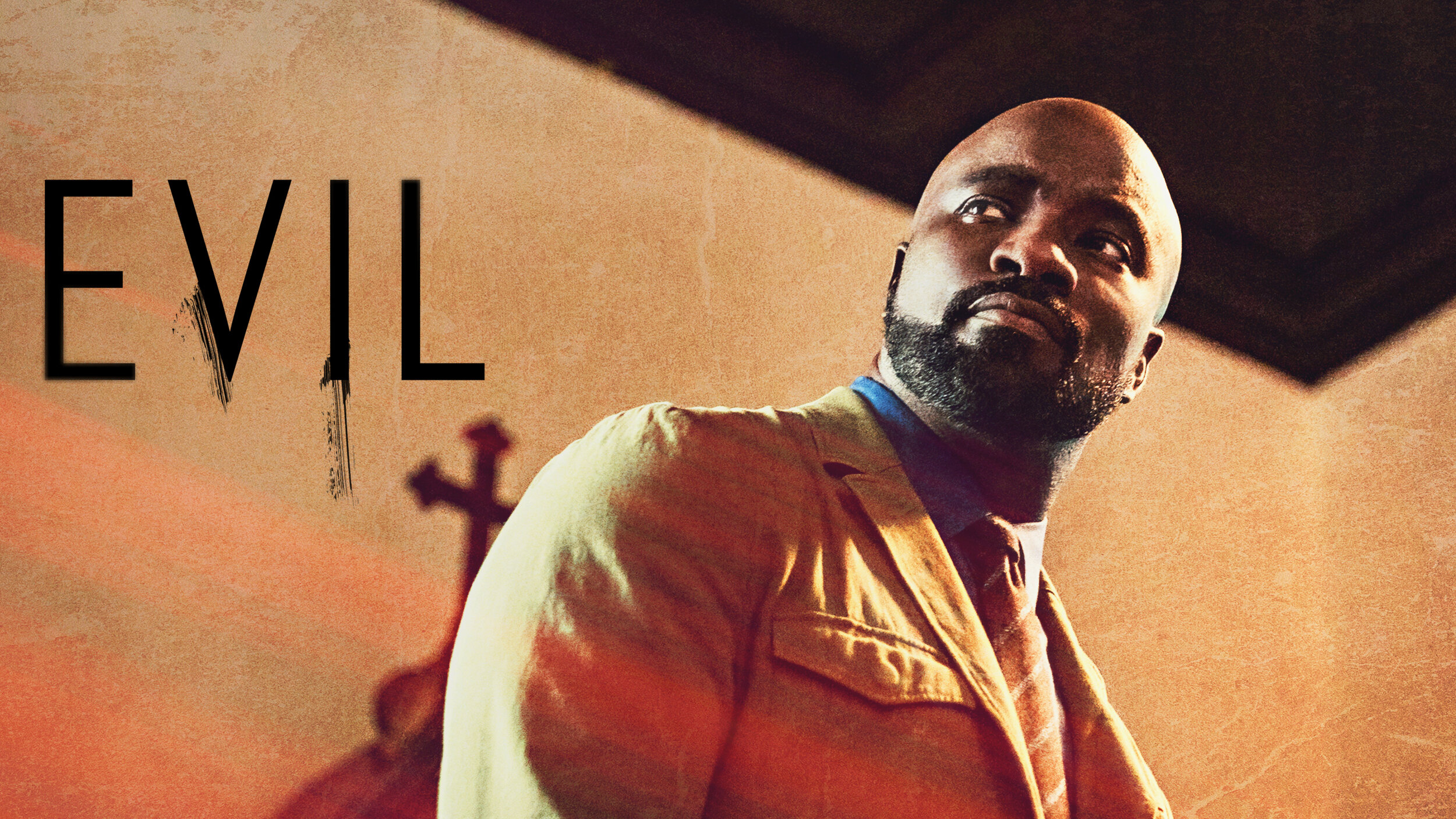
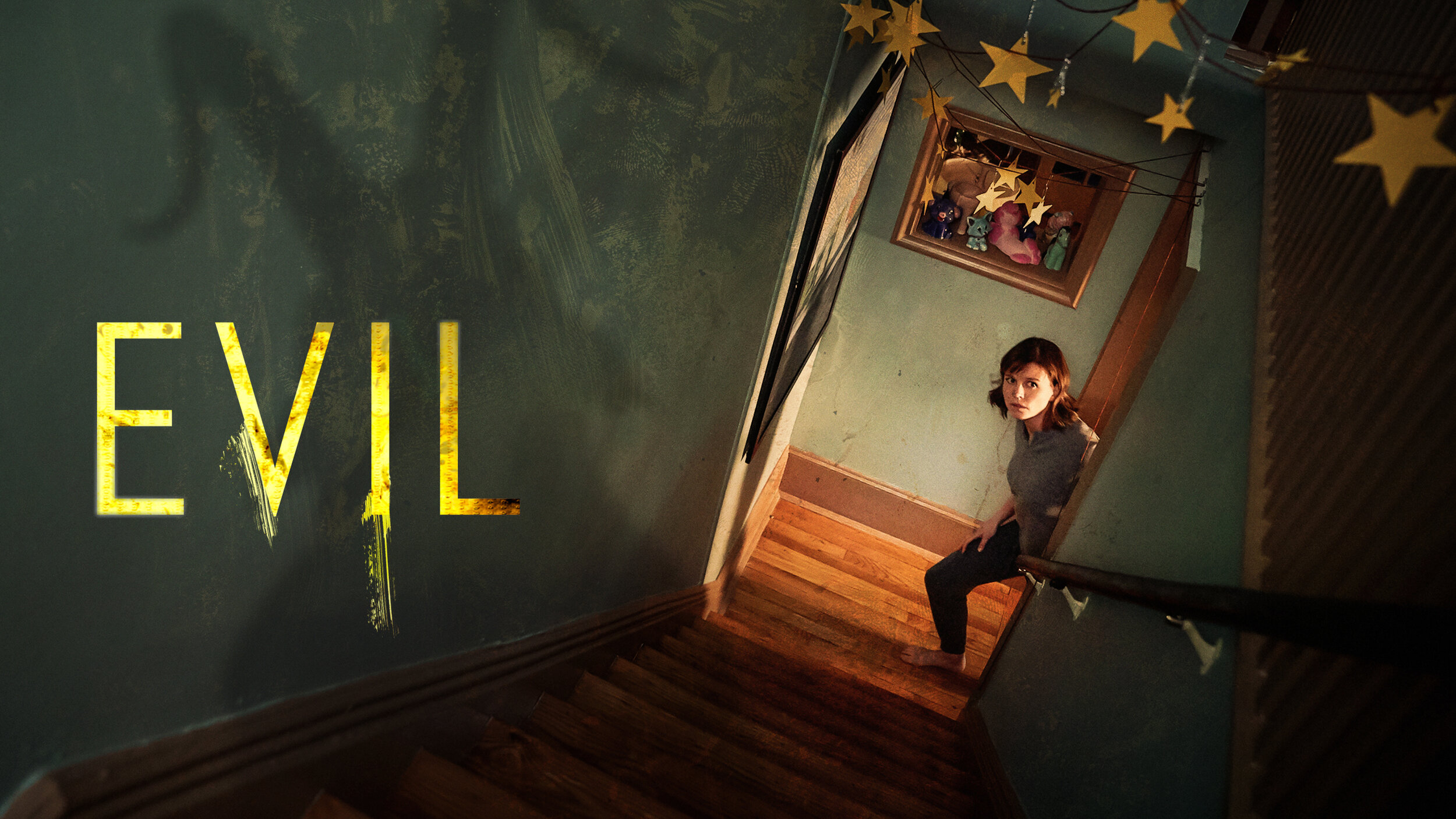
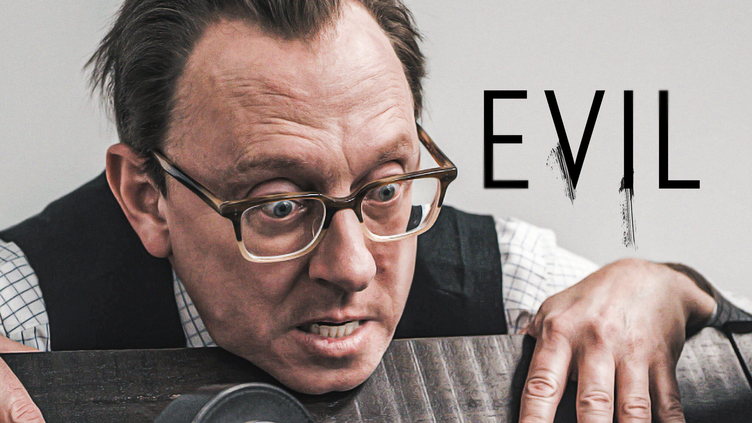
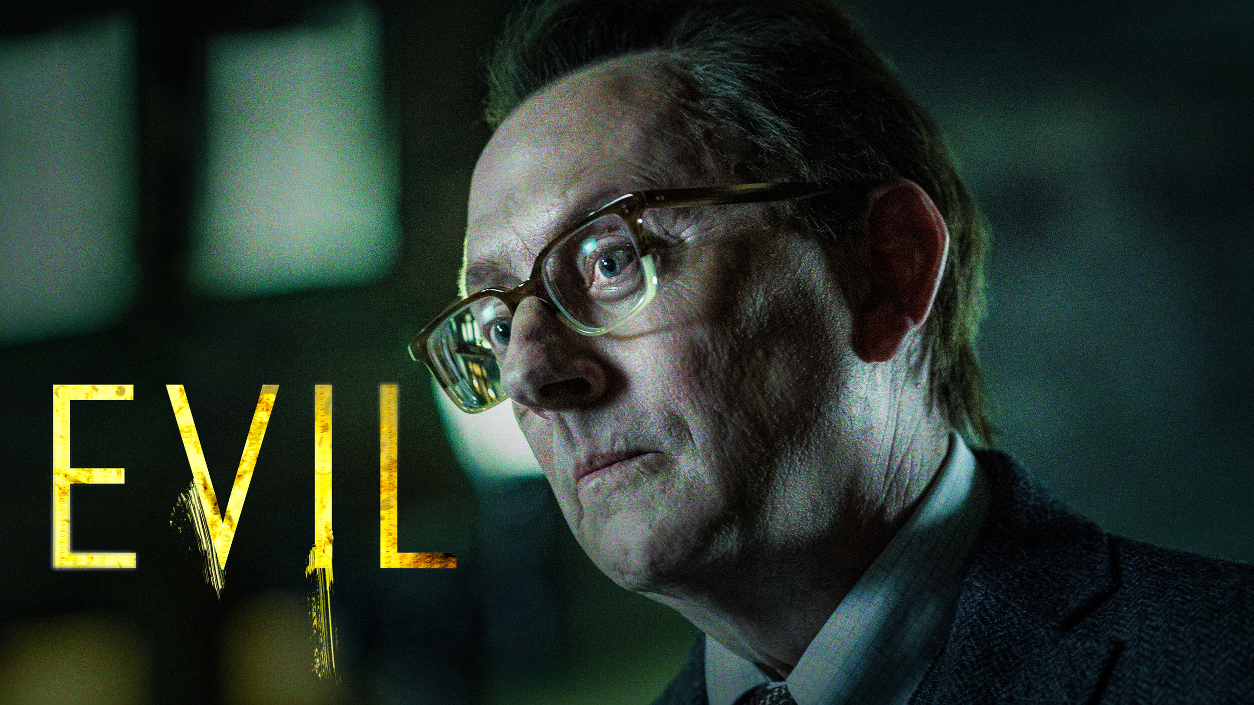
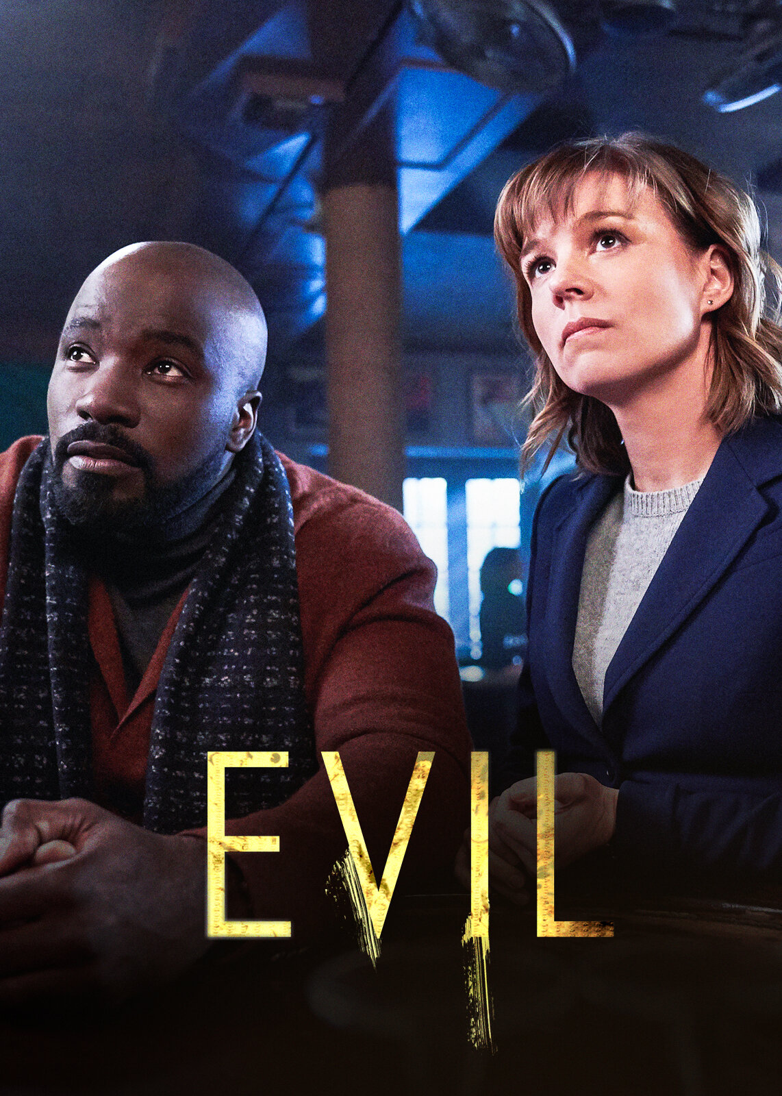
Netflix on platform campaign for Evil
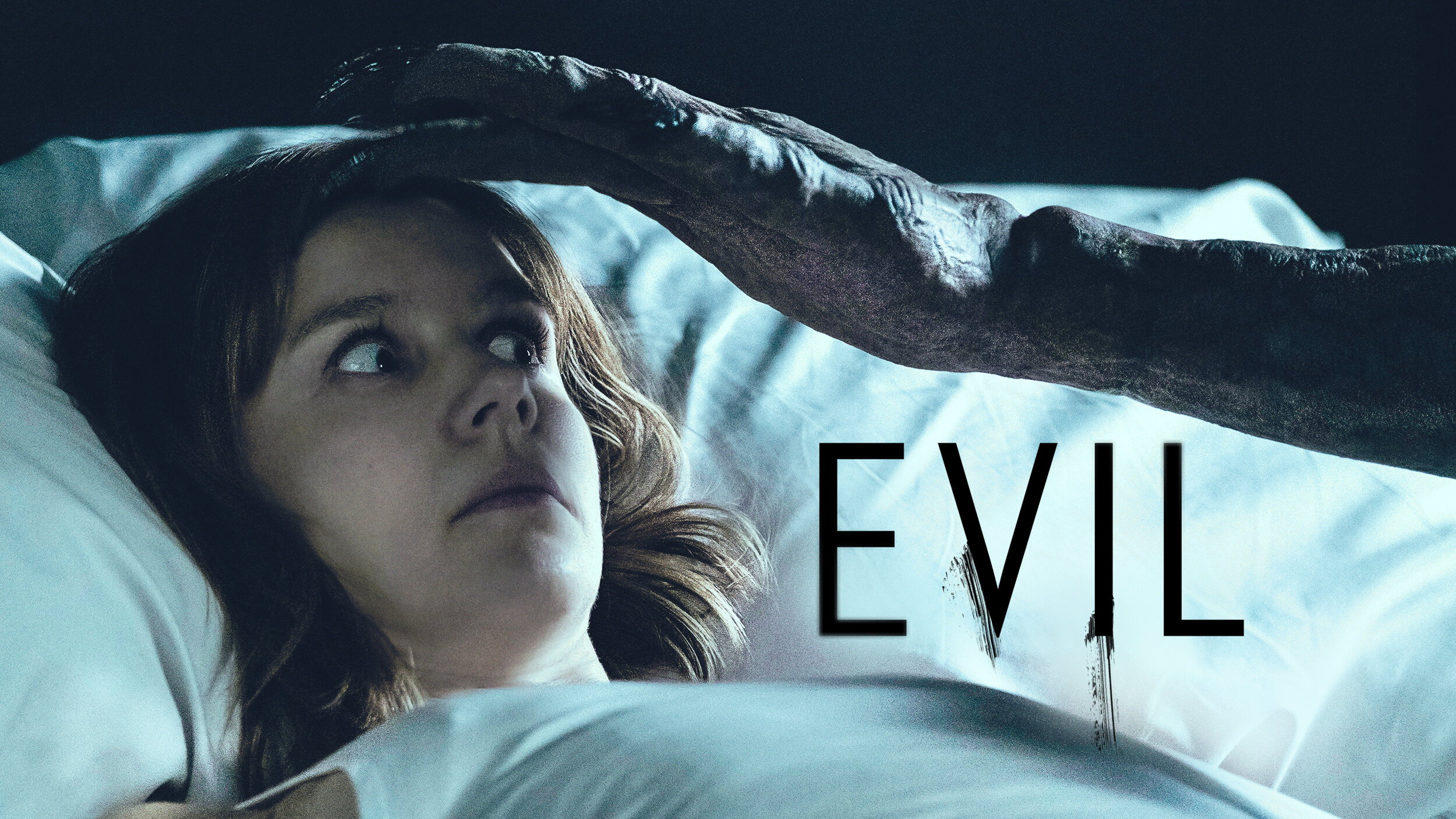
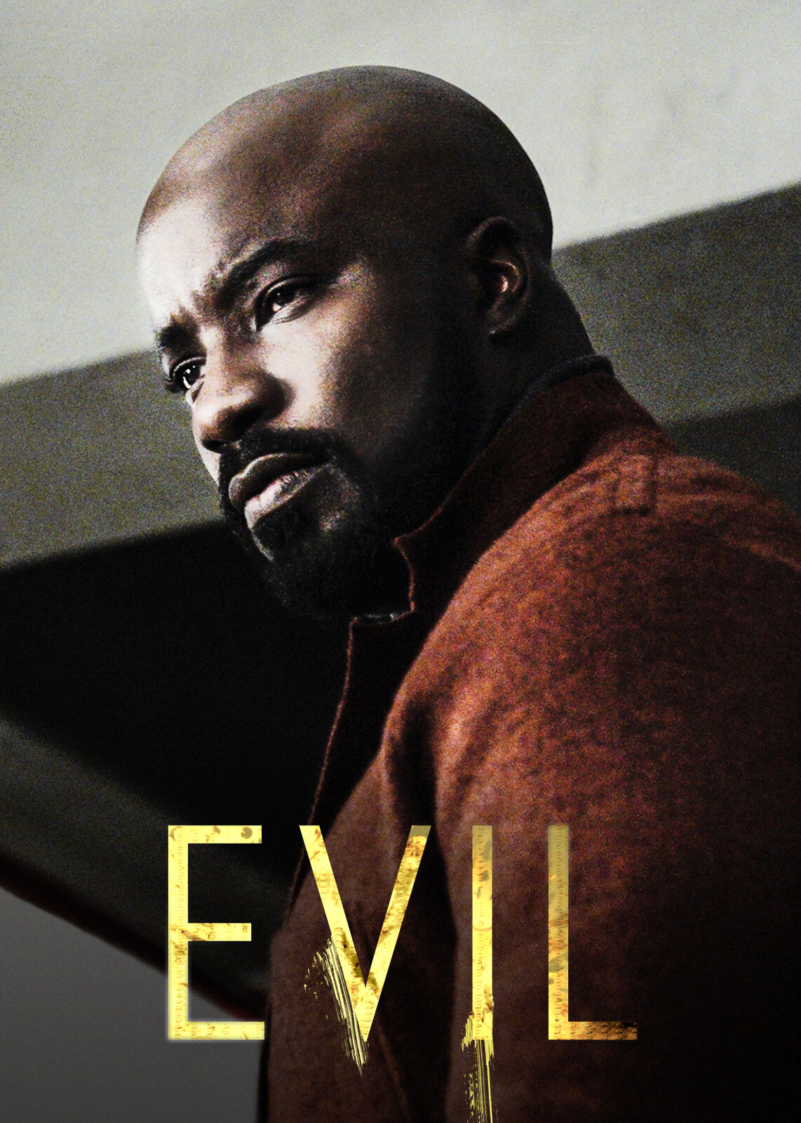
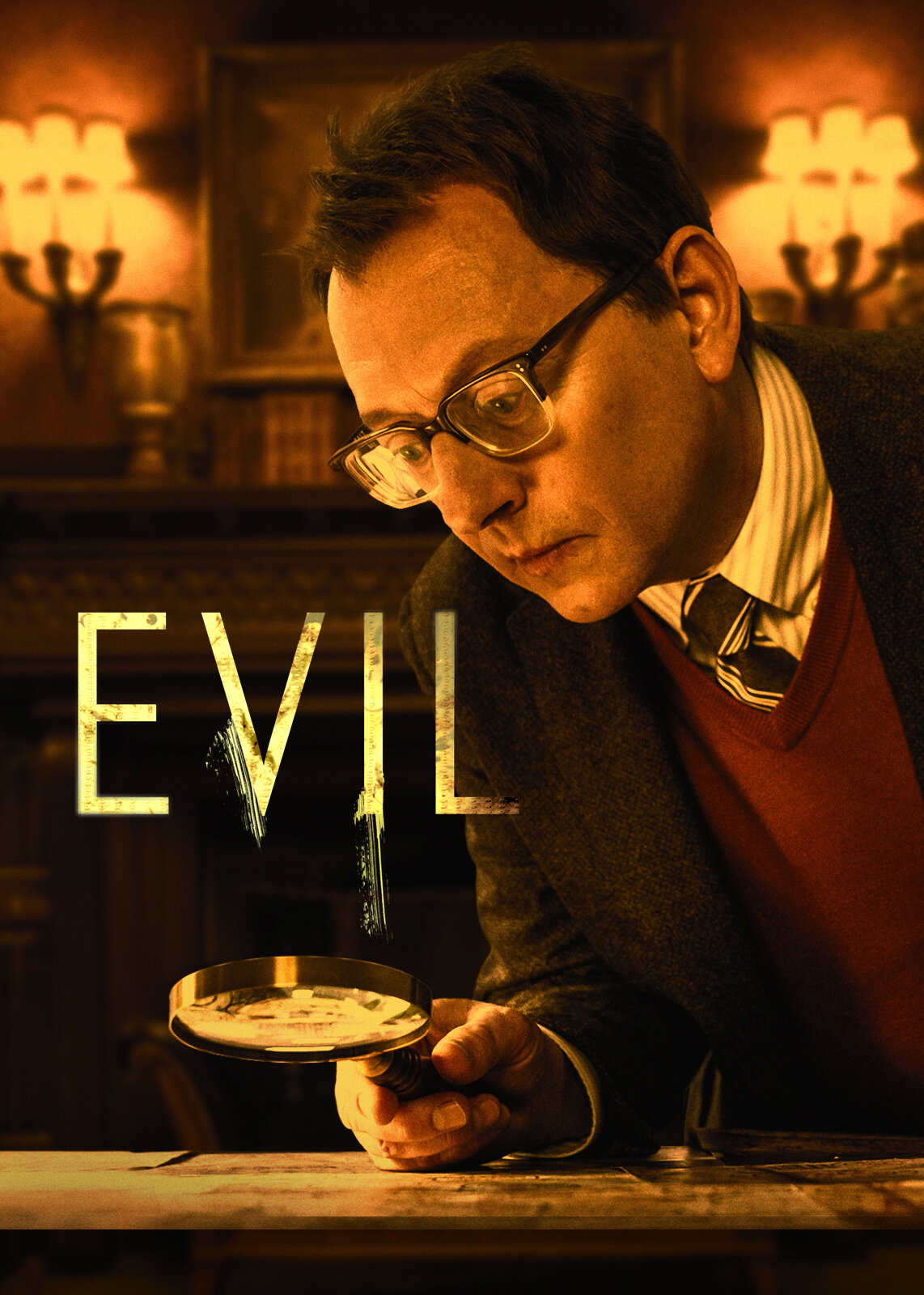
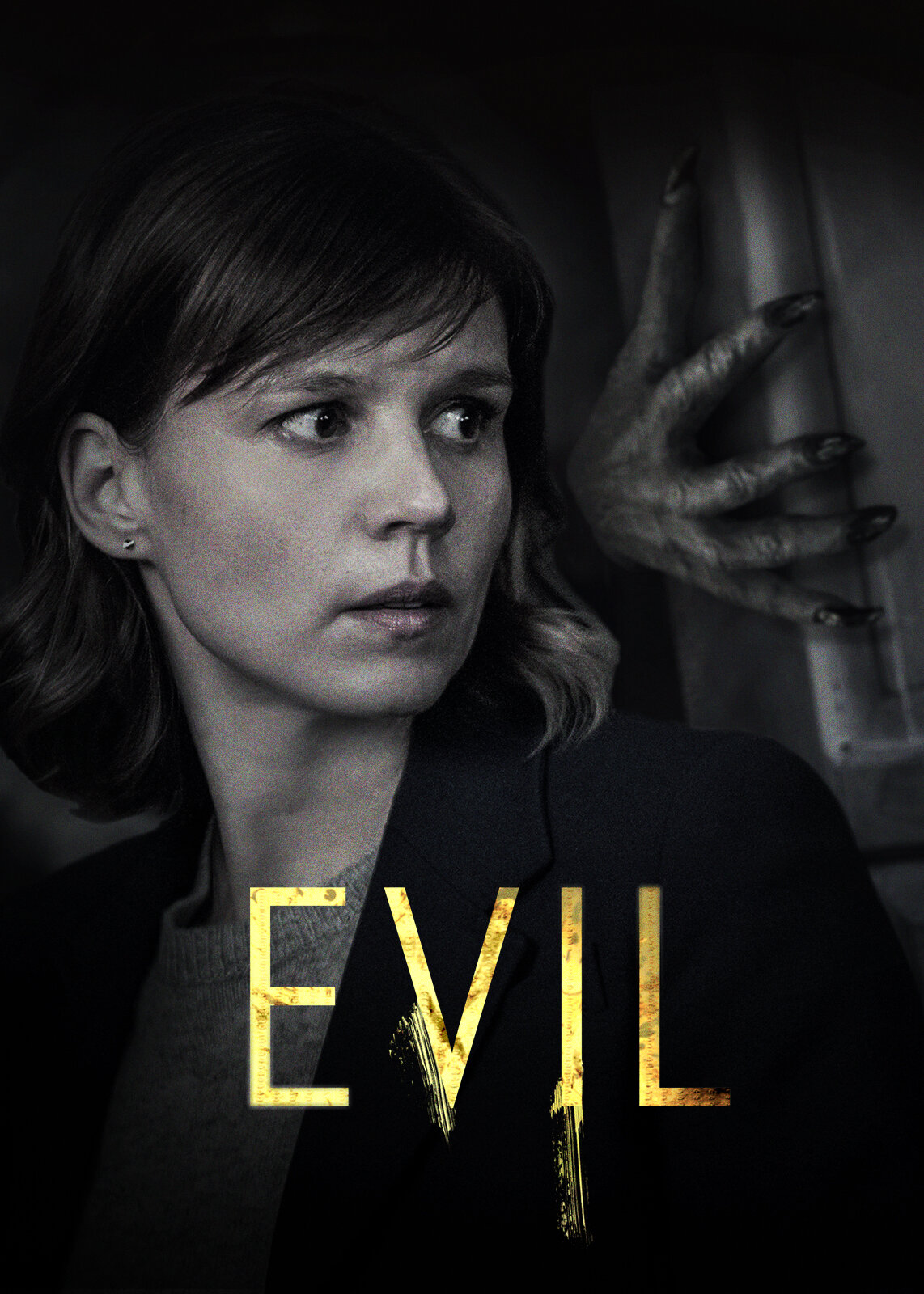
Evil is not your typical CBS show. And the marketing team at CBS Network and Netflix both agreed. They wanted to figure out a way to reach a broader audience, much like the model Schitt’s Creek followed previously. At the same time, Netflix was looking to bolster their October Horror Line up. Evil was the perfect fit.
My role on the project
As the creative director on this project, I worked with various teams across CBS Network and Netflix to pull together assets and get the layouts approved. My job was to find that balance between horror and supernatural while keeping the nature of the investigative show. I wanted each piece to hint at the dark forces at work behind the dichotomy of the main characters.
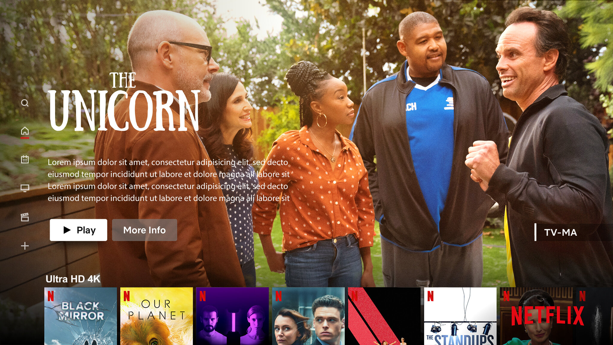
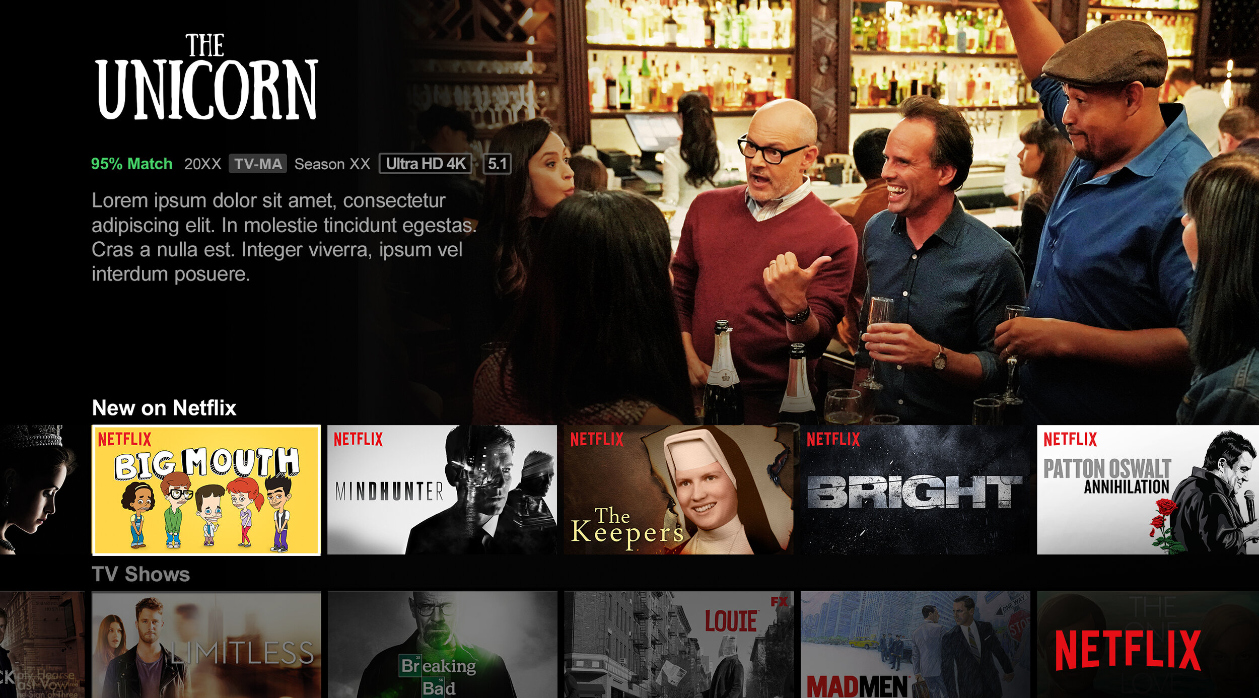
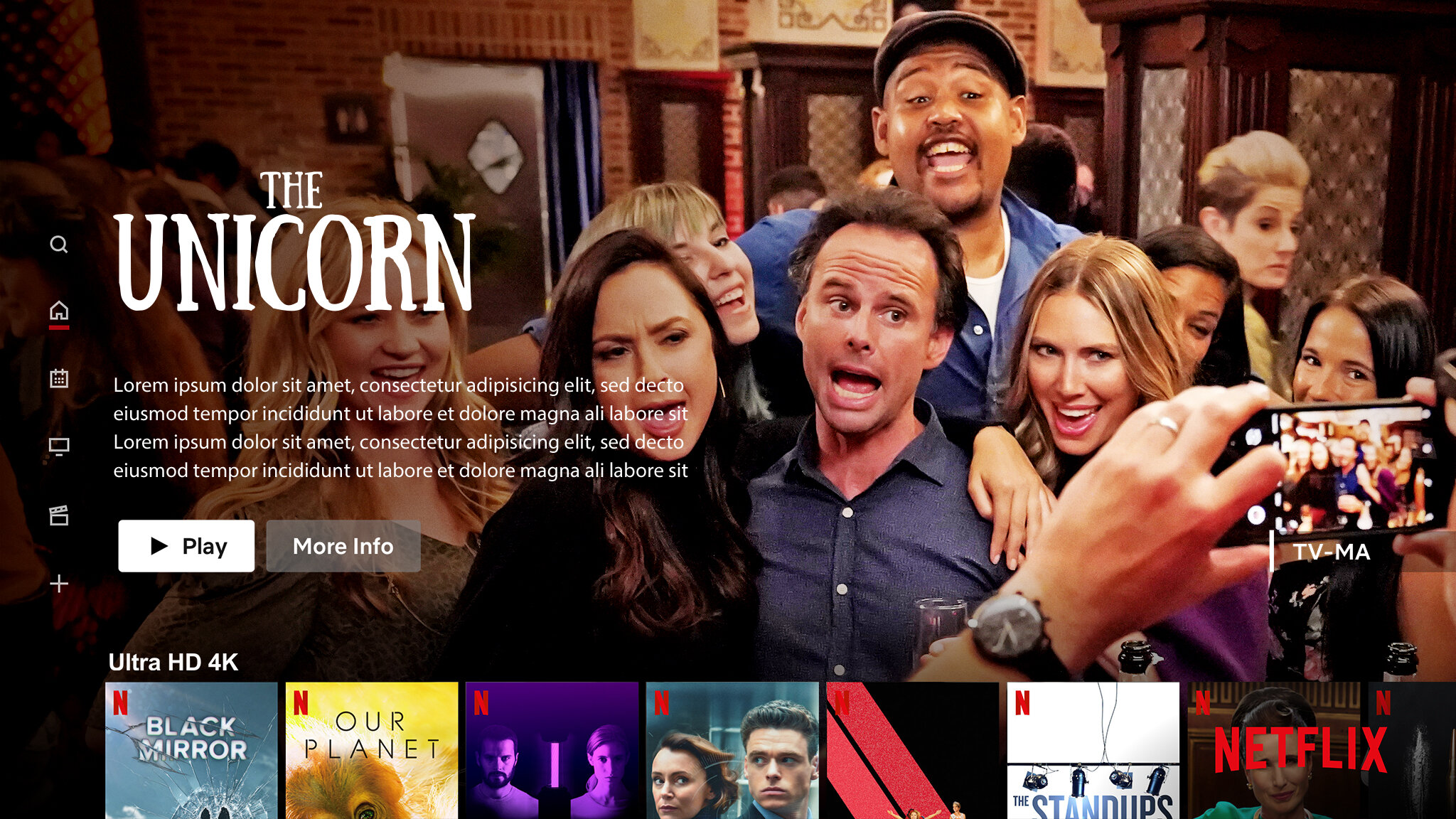
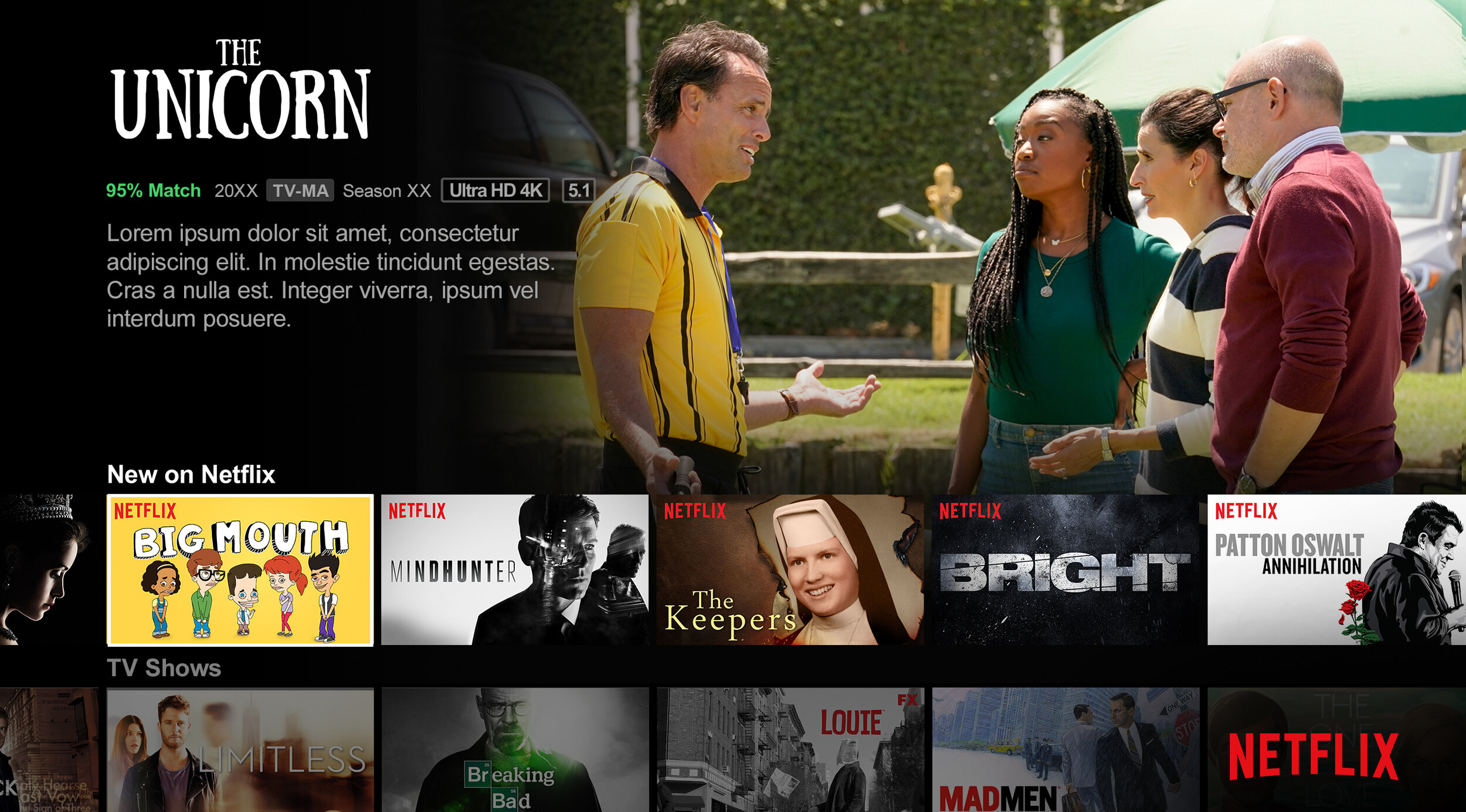
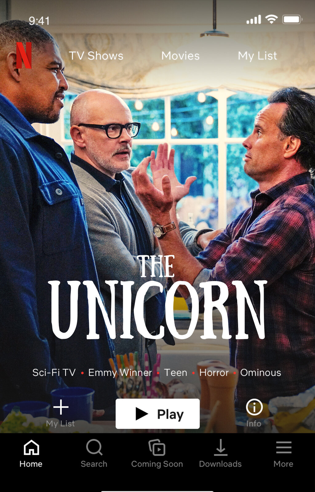
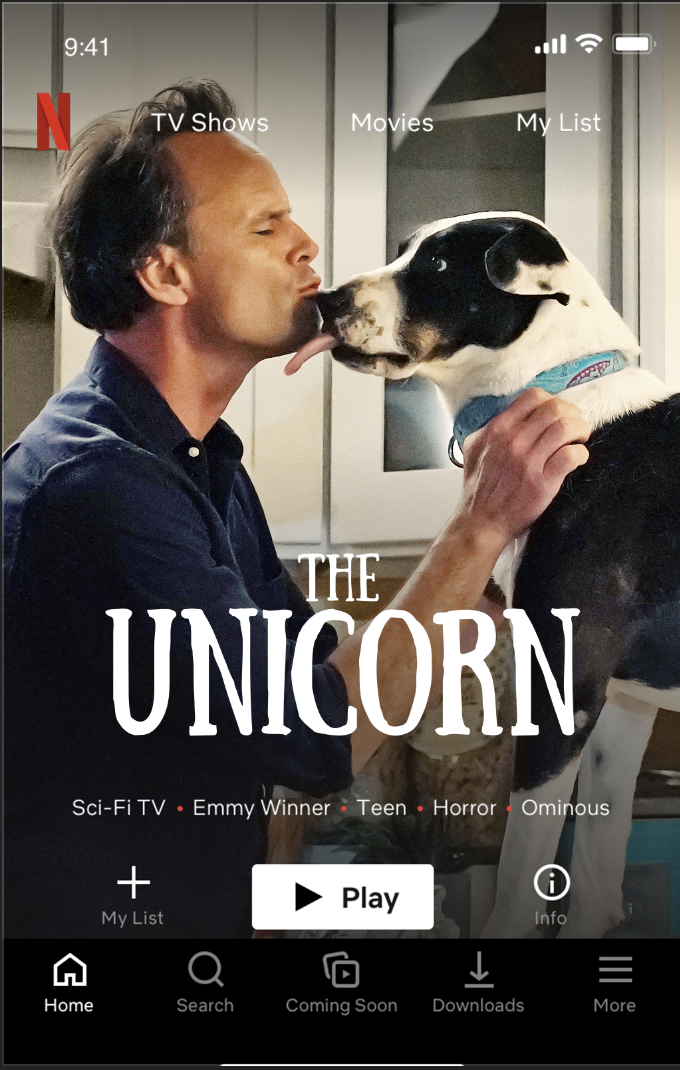
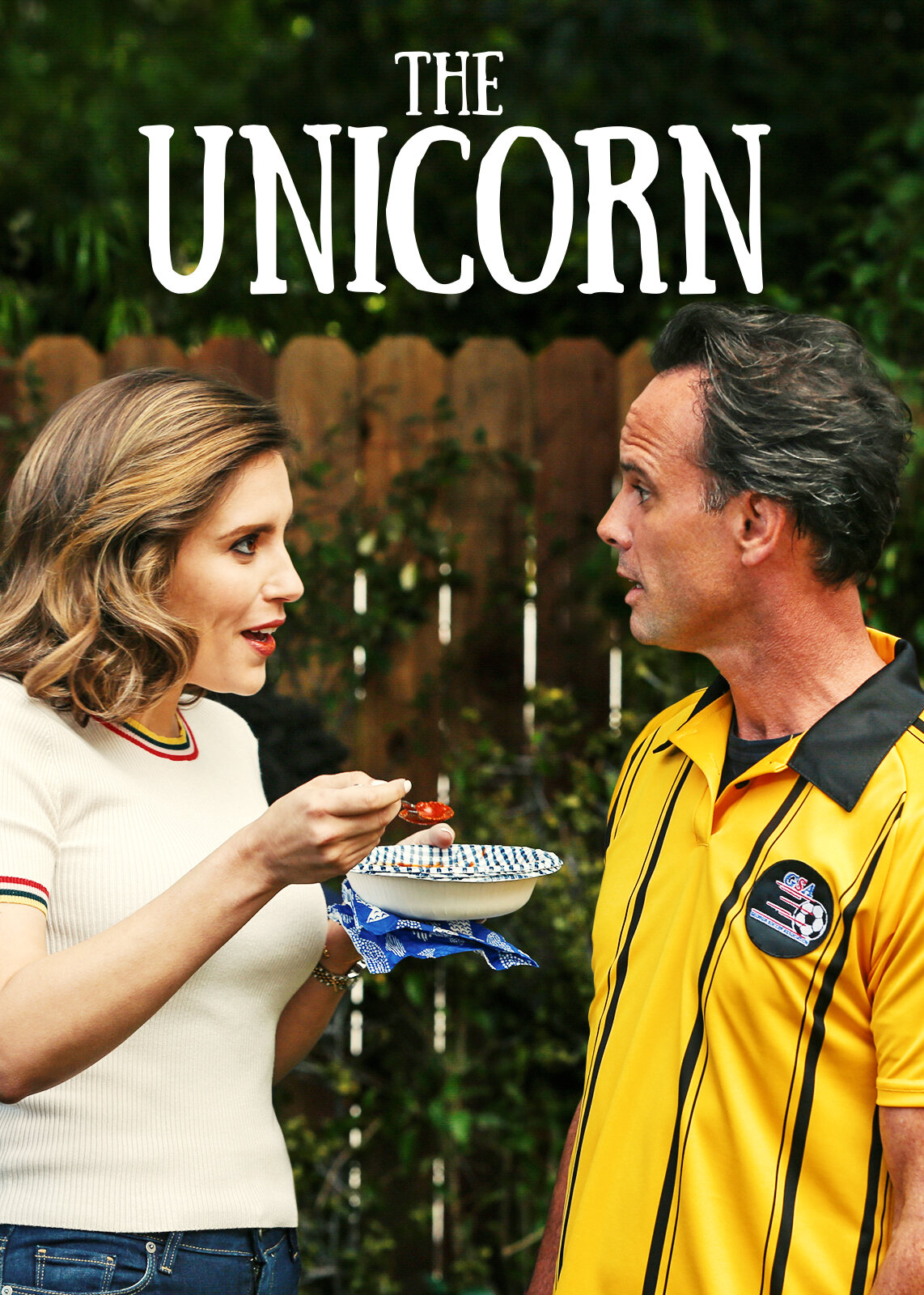
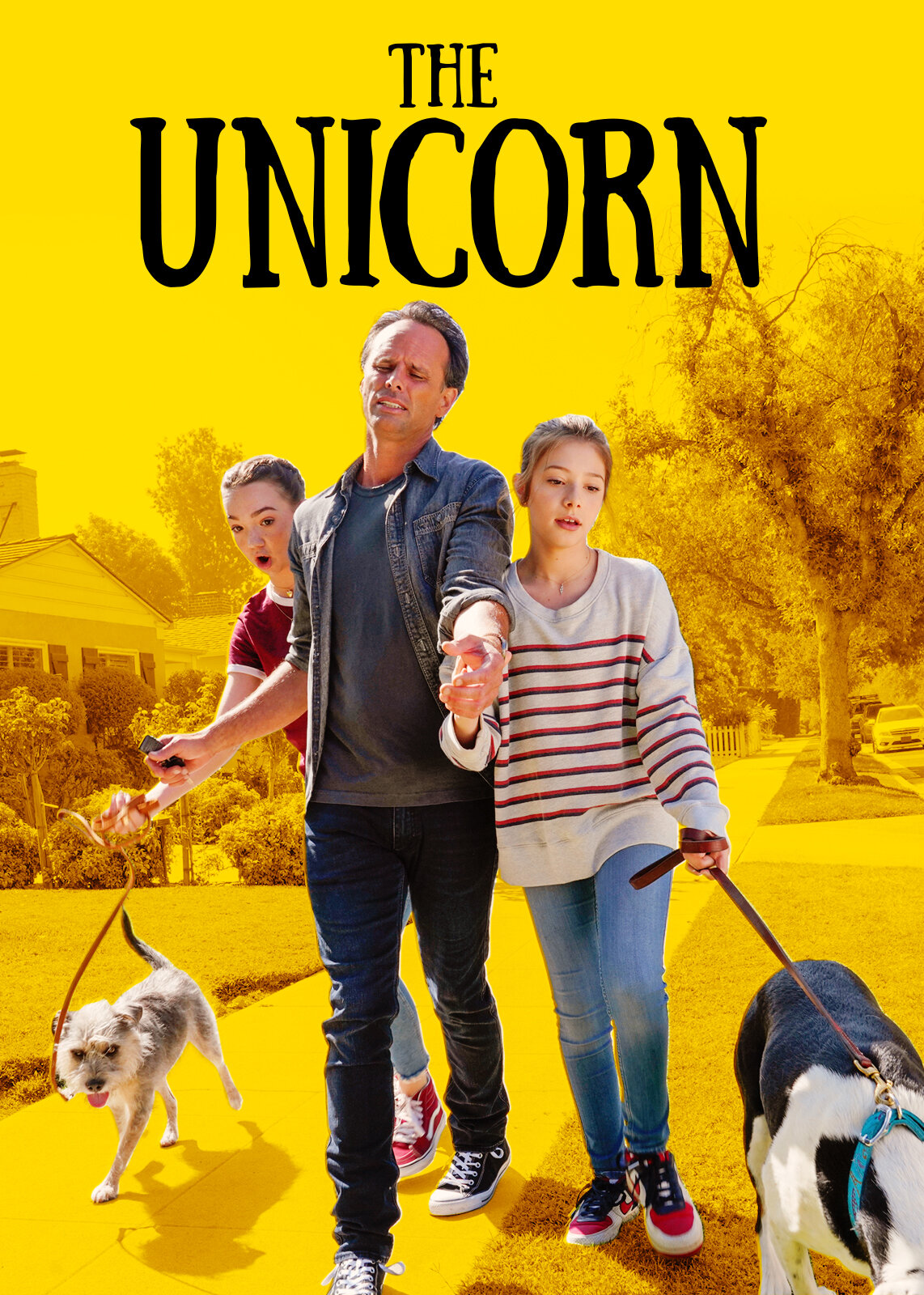
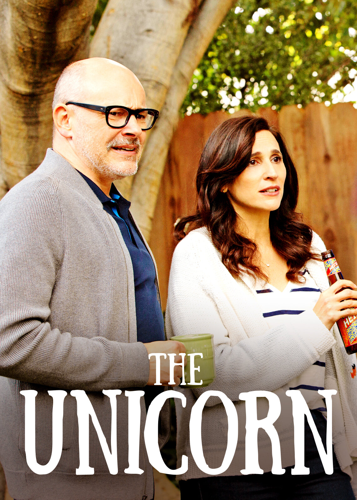
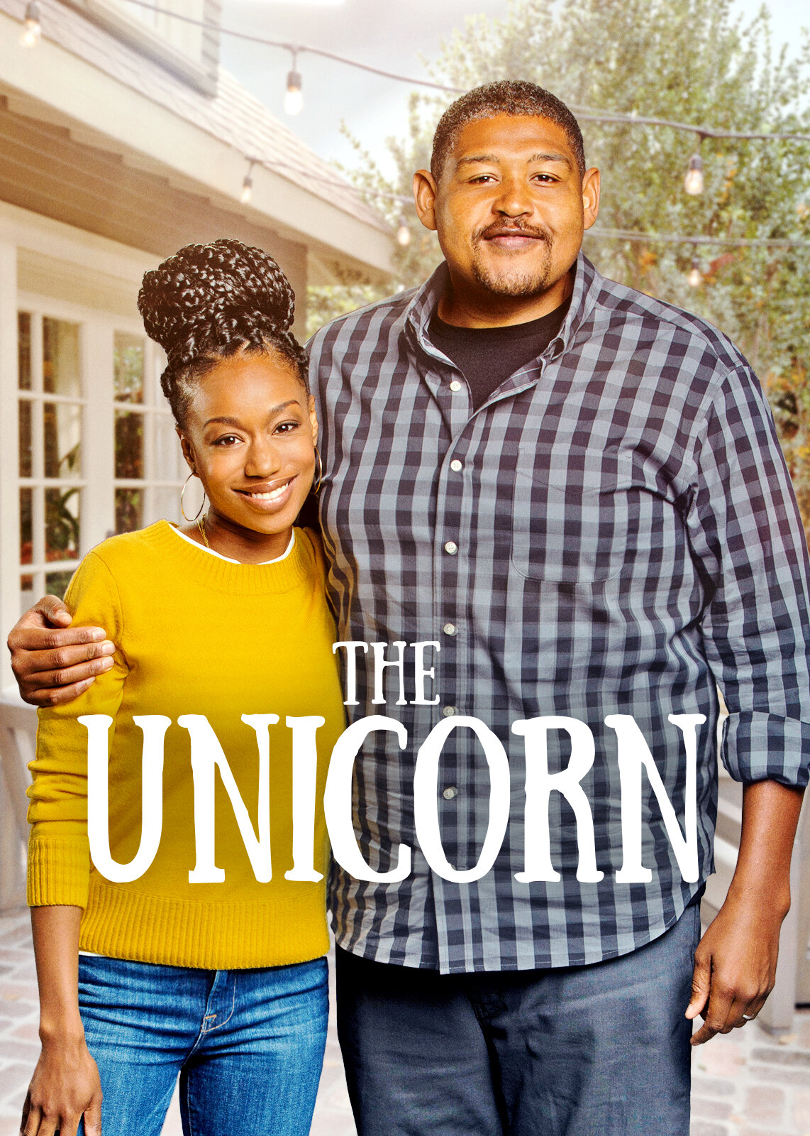
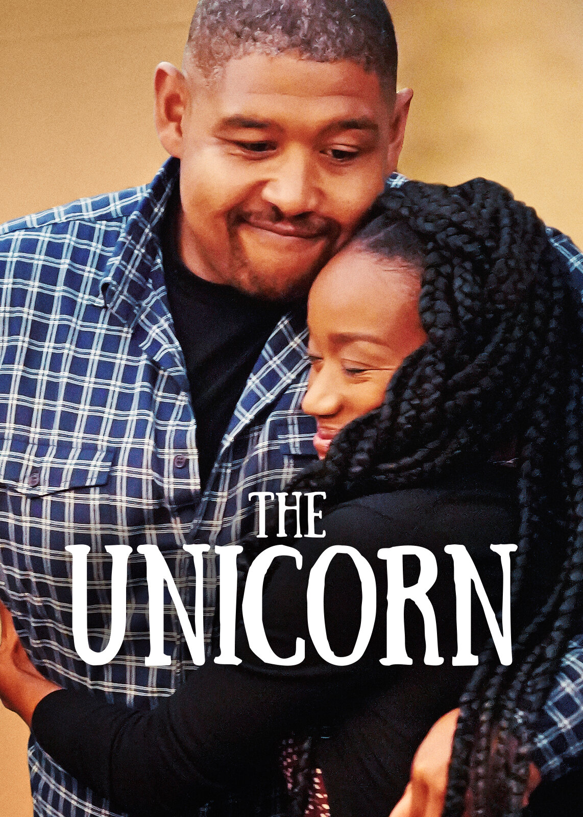
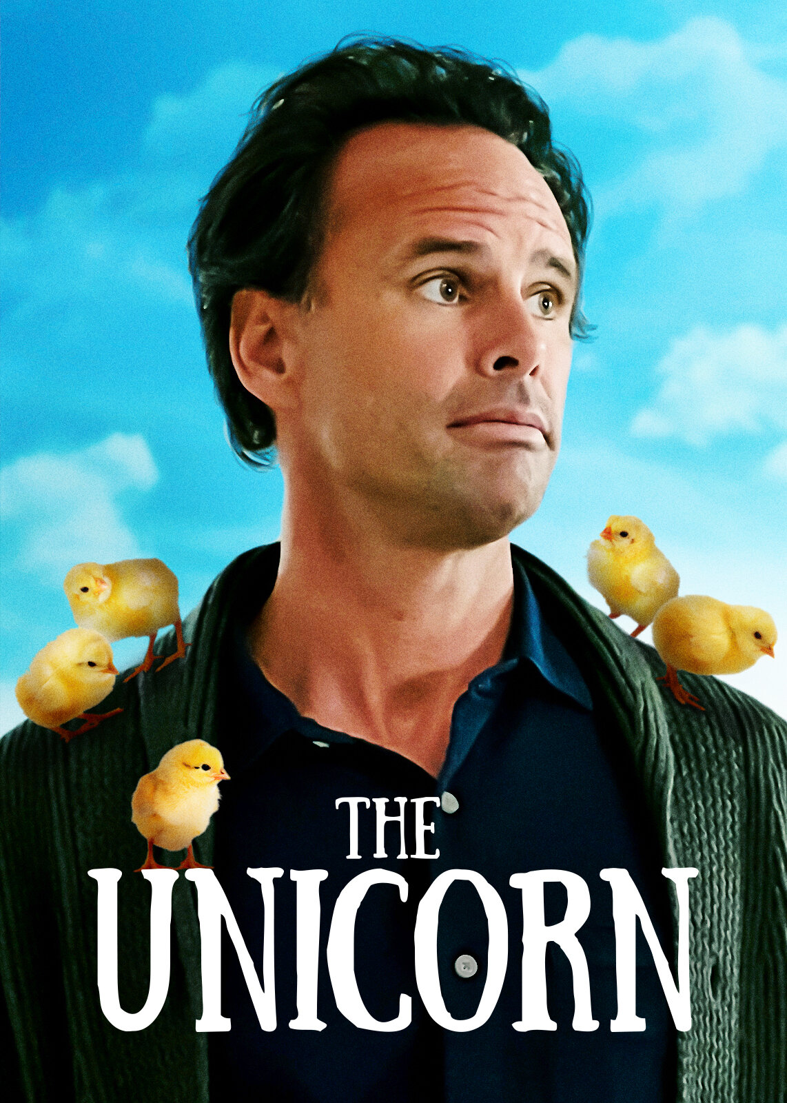
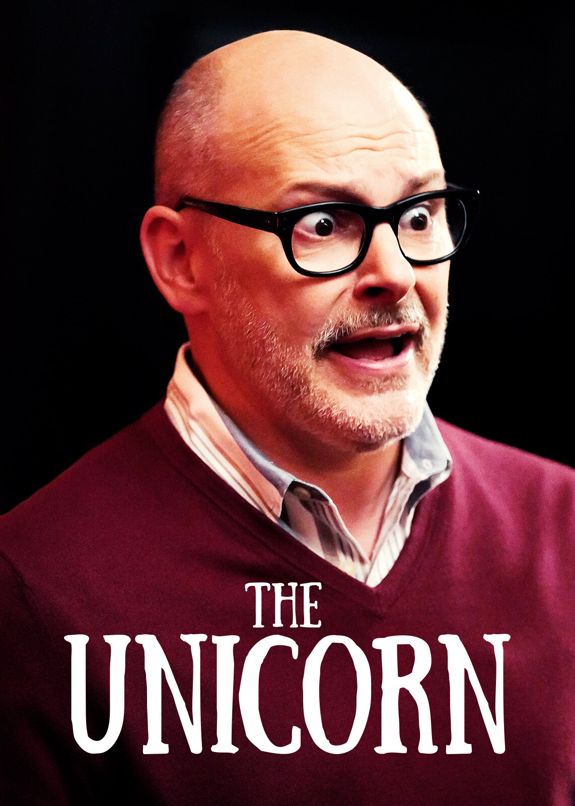
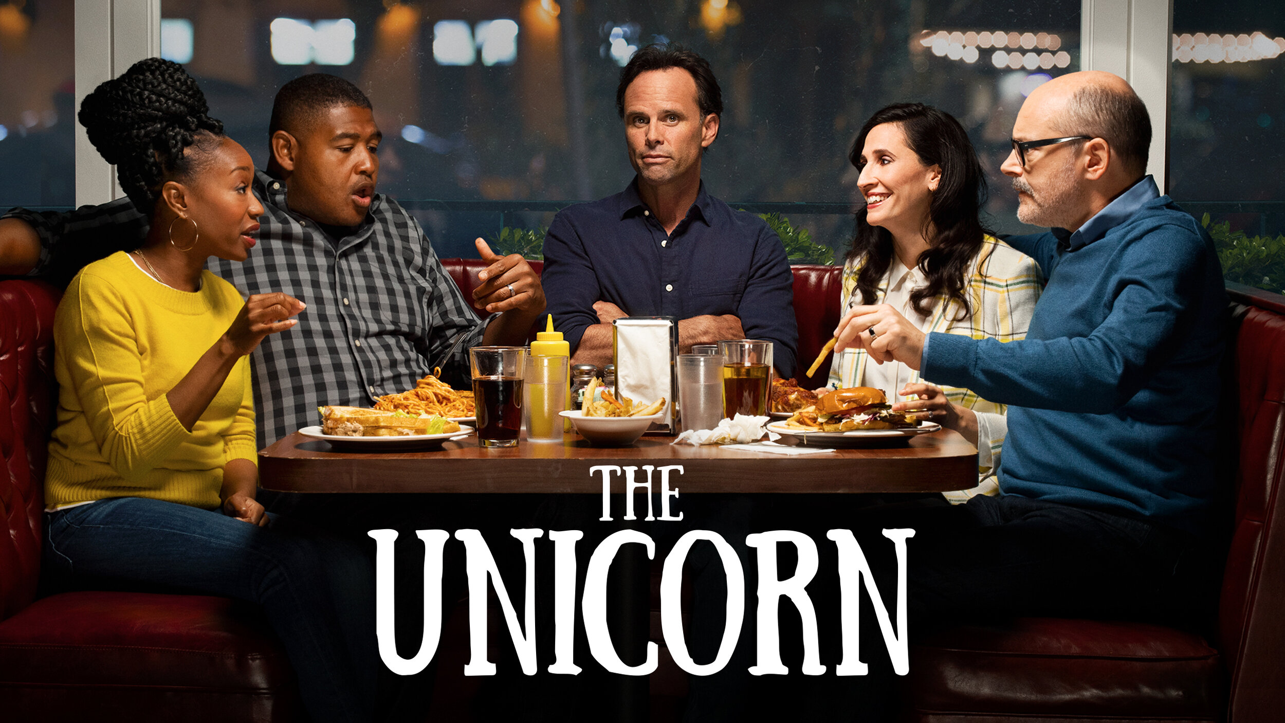
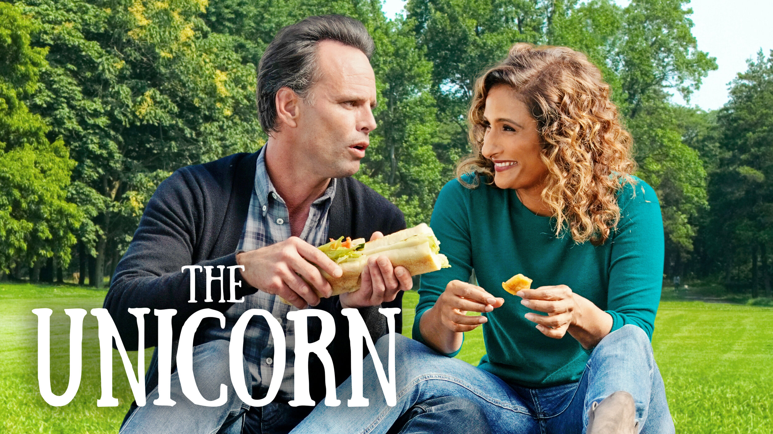
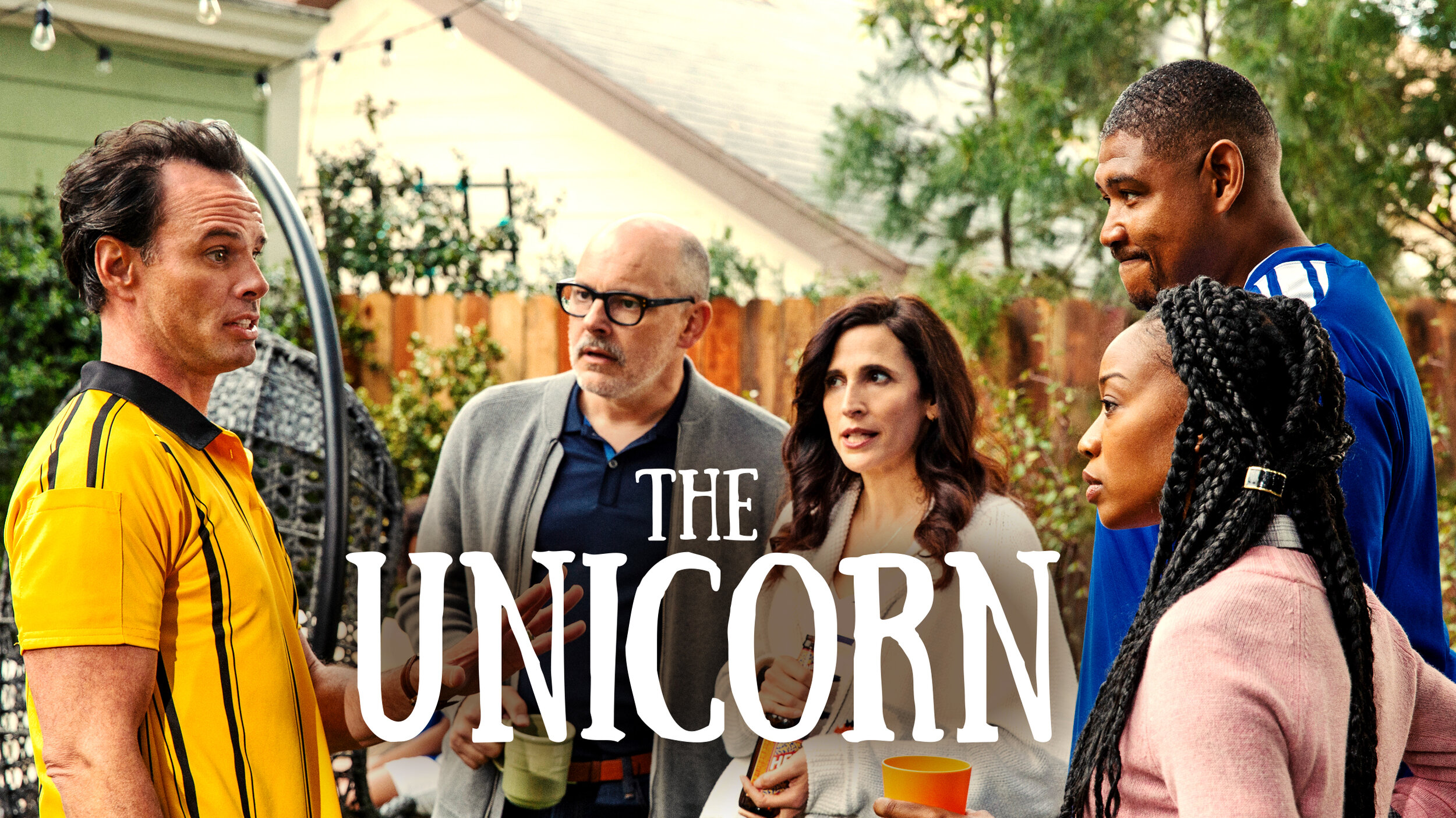
Netflix on-platform campaign for The Unicorn
The Unicorn is such a great show because it’s a down-to-earth comedy. It’s relatable on so many levels and the CBS Network marketing team felt that a platform like Netflix would help boost The Unicorn’s audience. Everyone always finds something they love about the show.
My role on the project
As the creative director on this project, I worked with various teams across CBS Network and Netflix to pull together assets and get the layouts approved. My goal for this campaign was to focus on those candid photography. This series is so heartwarming because all those lovable moments never felt planned. Wade’s interactions with his daughters and friends while trying to understand online dating are so relatable and real that I wanted to bring those feelings to the artwork.
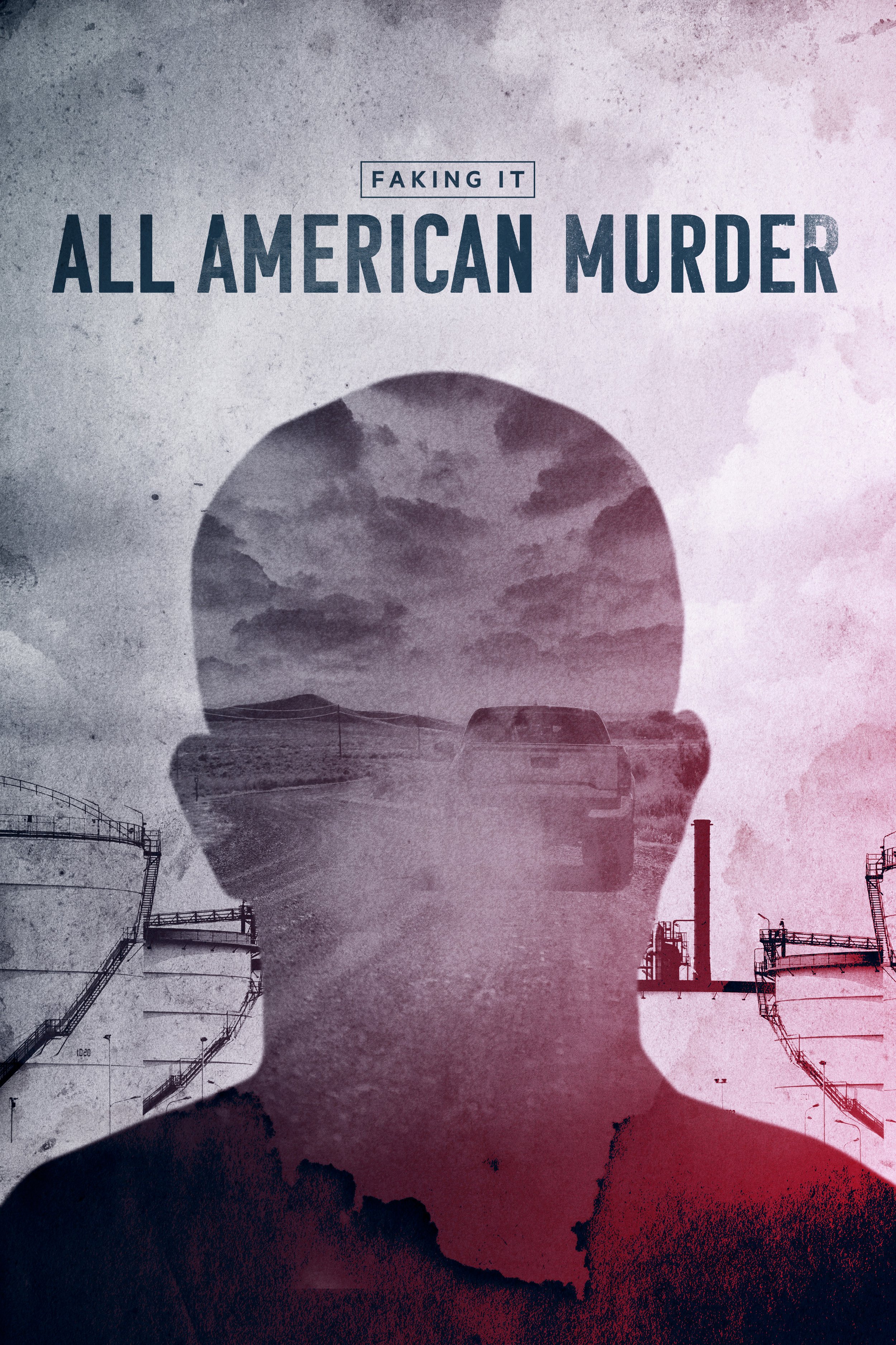
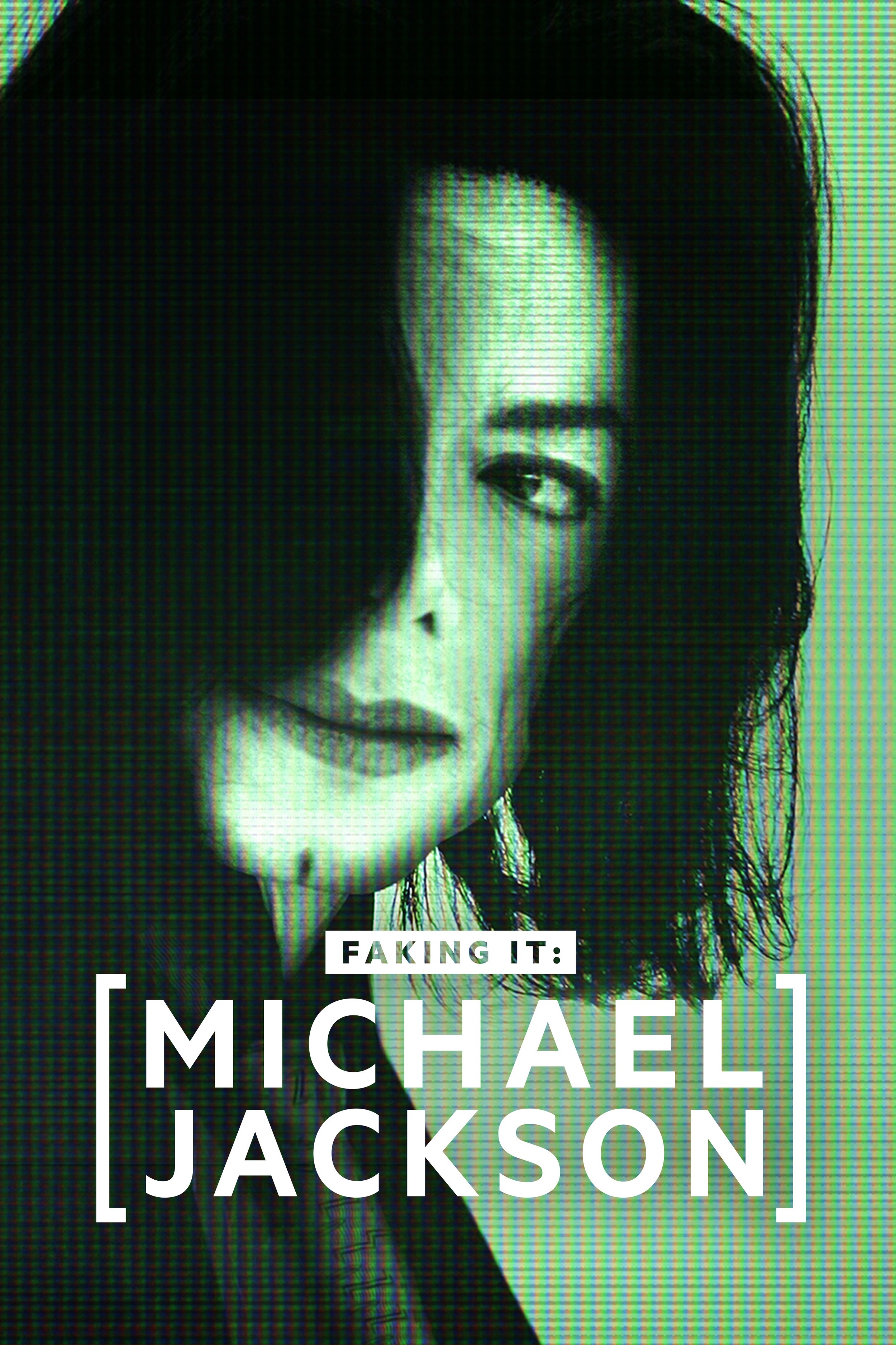
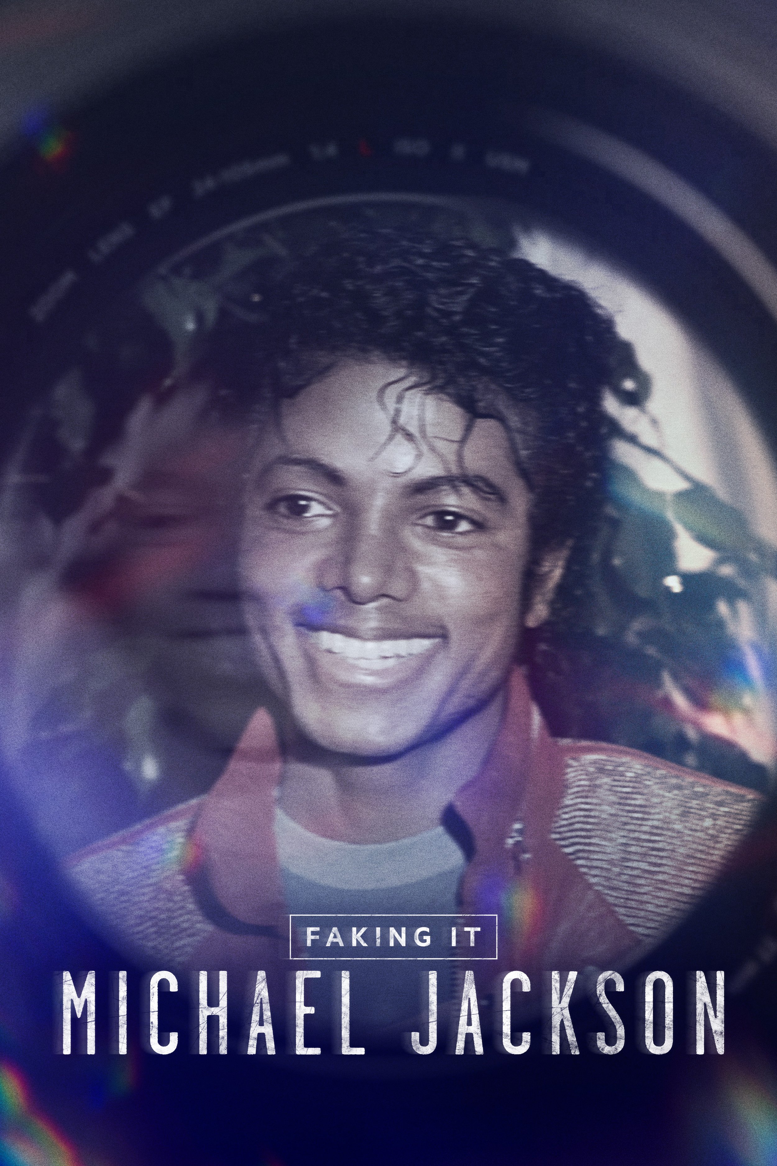
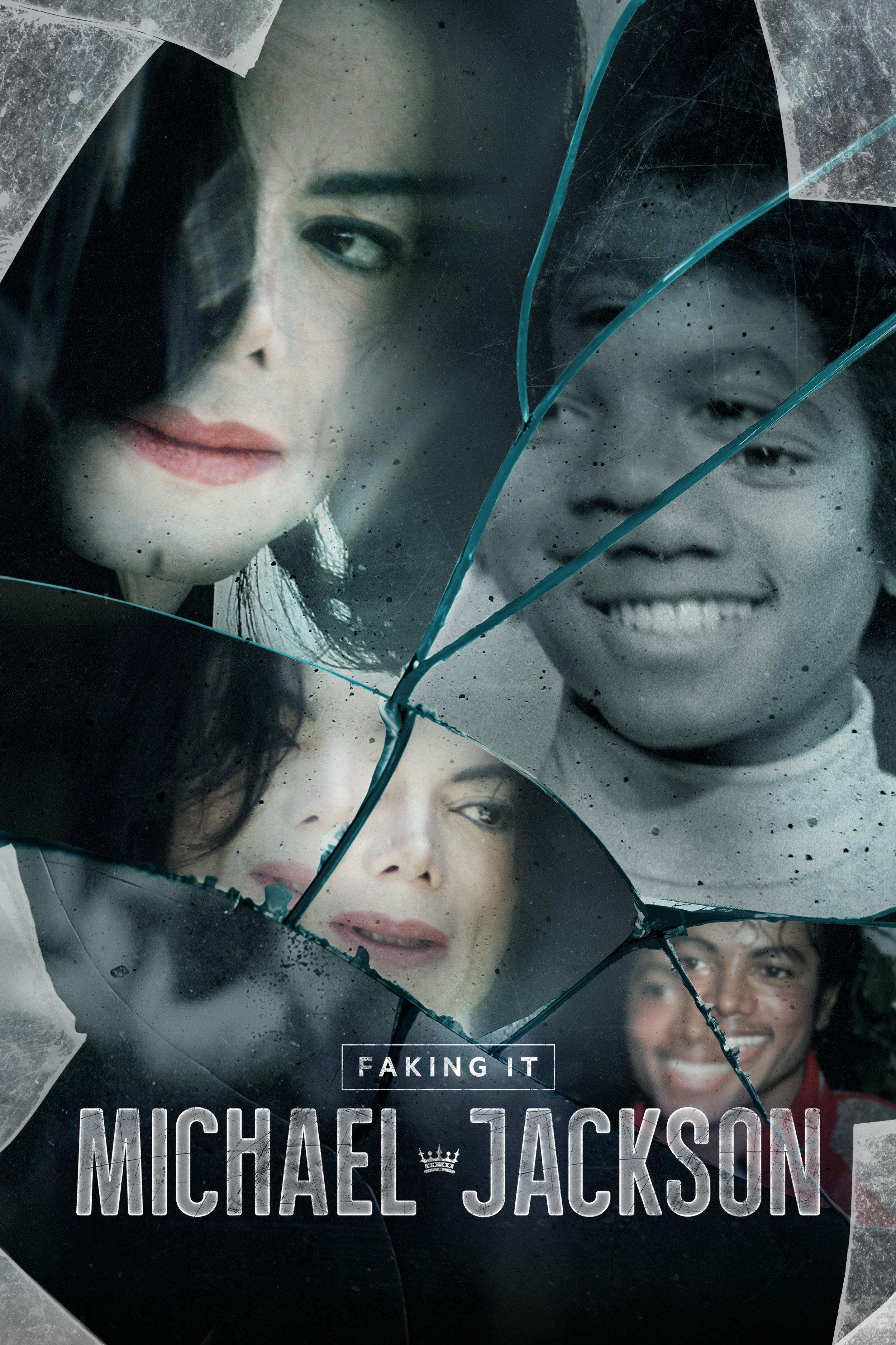
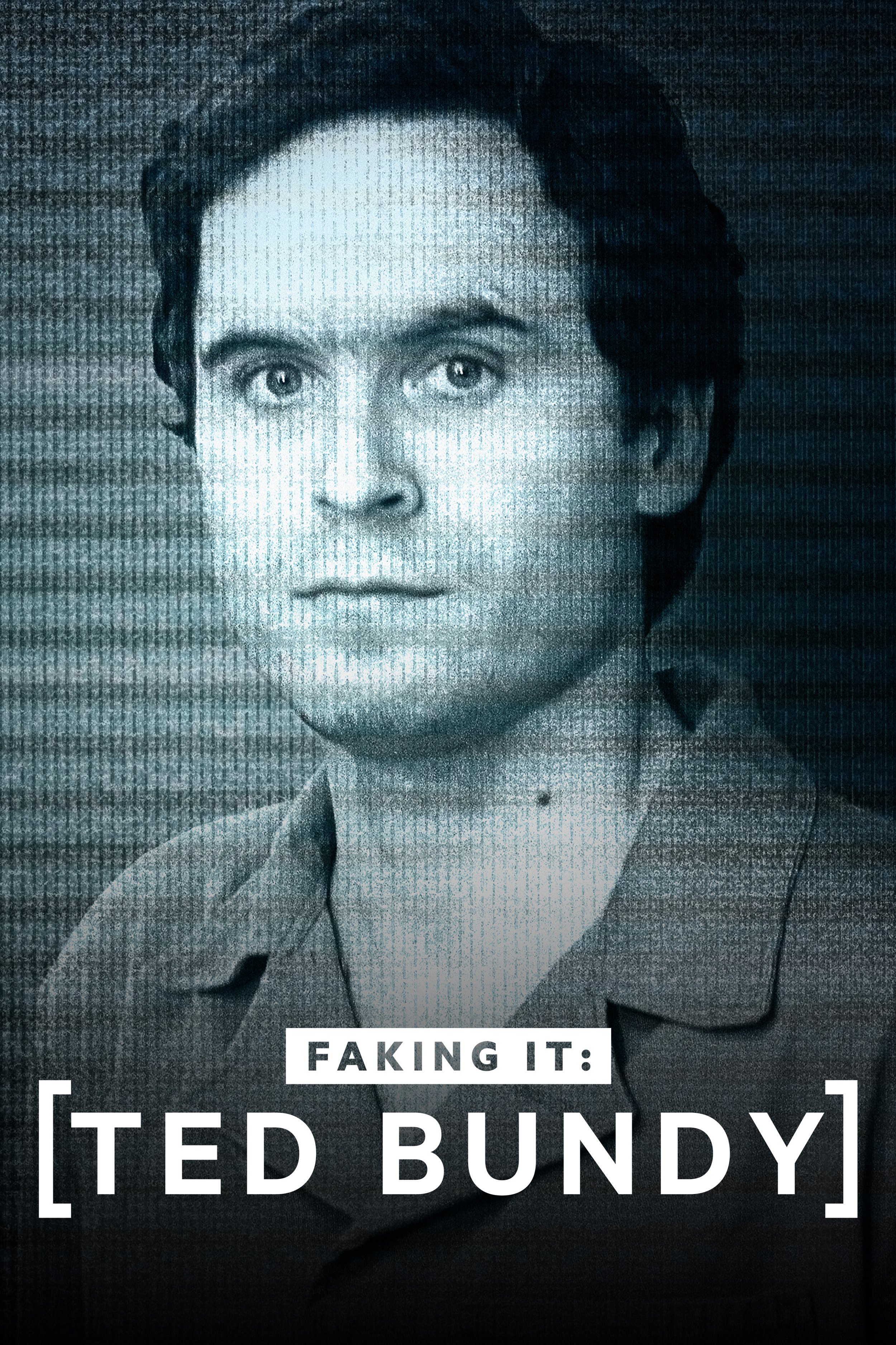
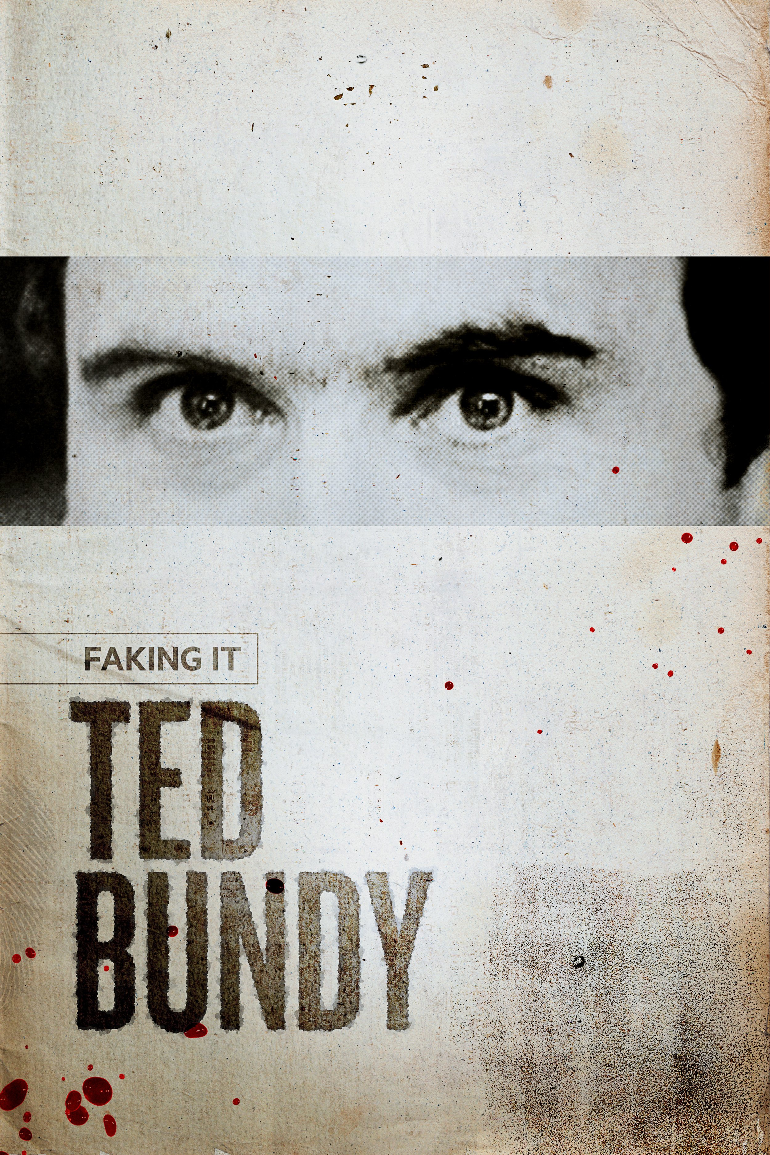
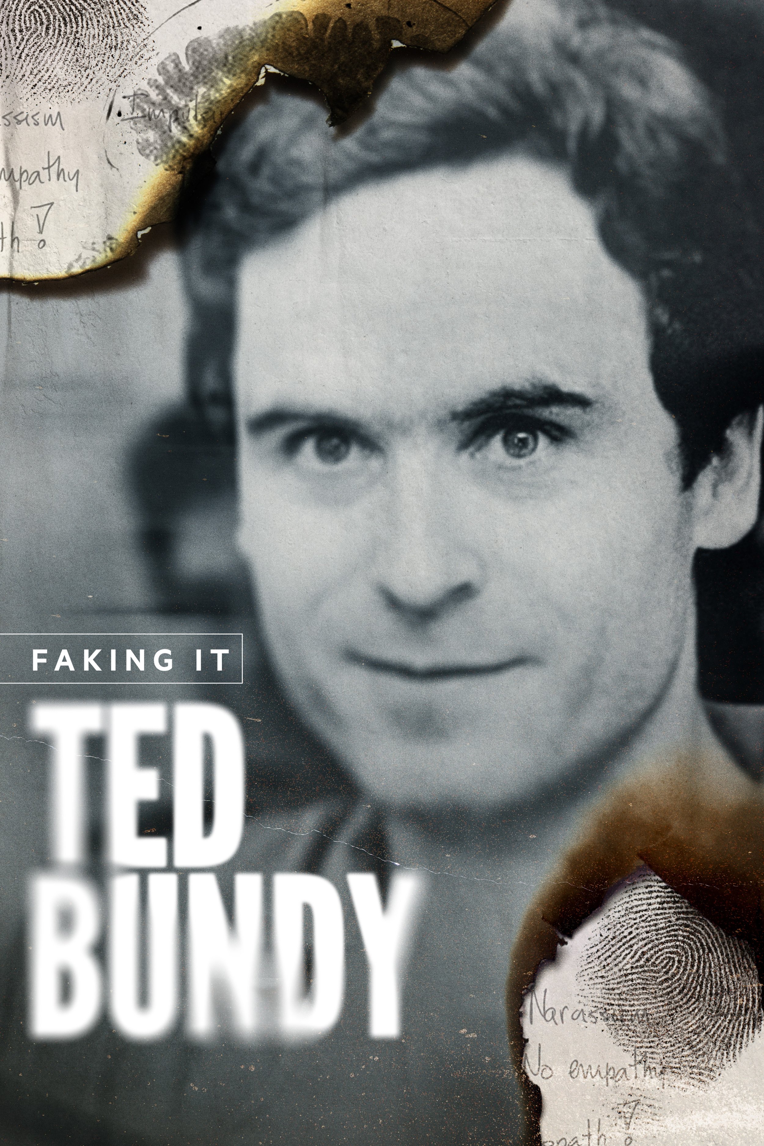

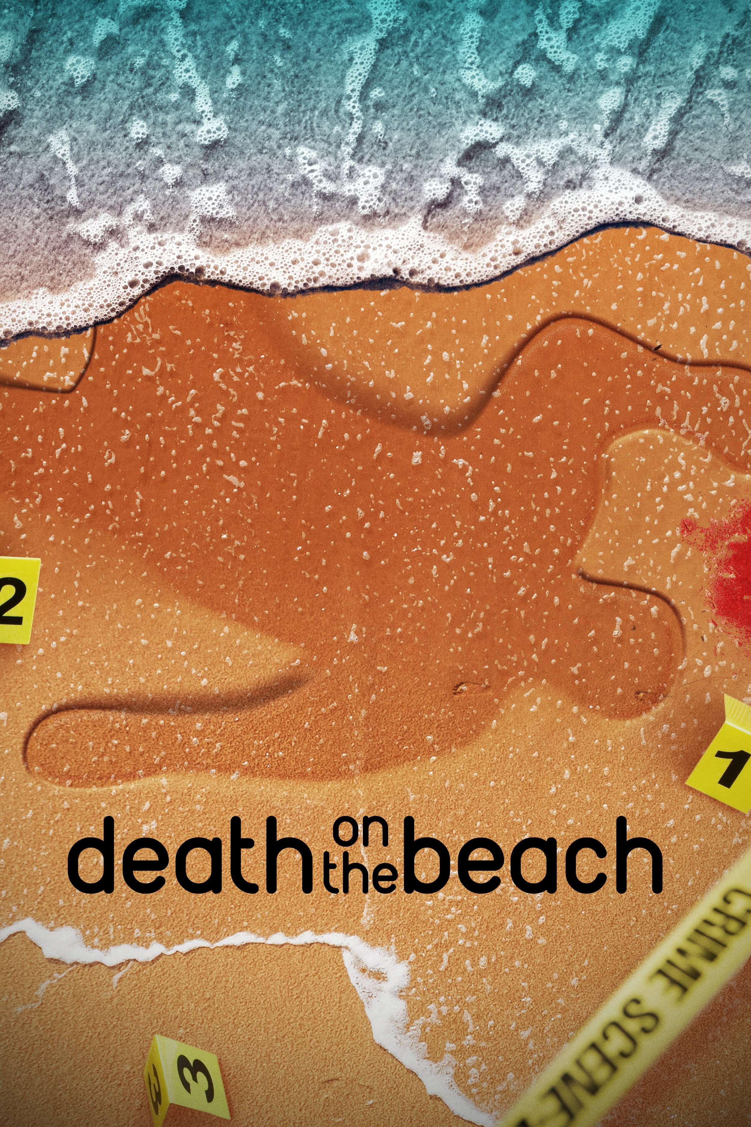
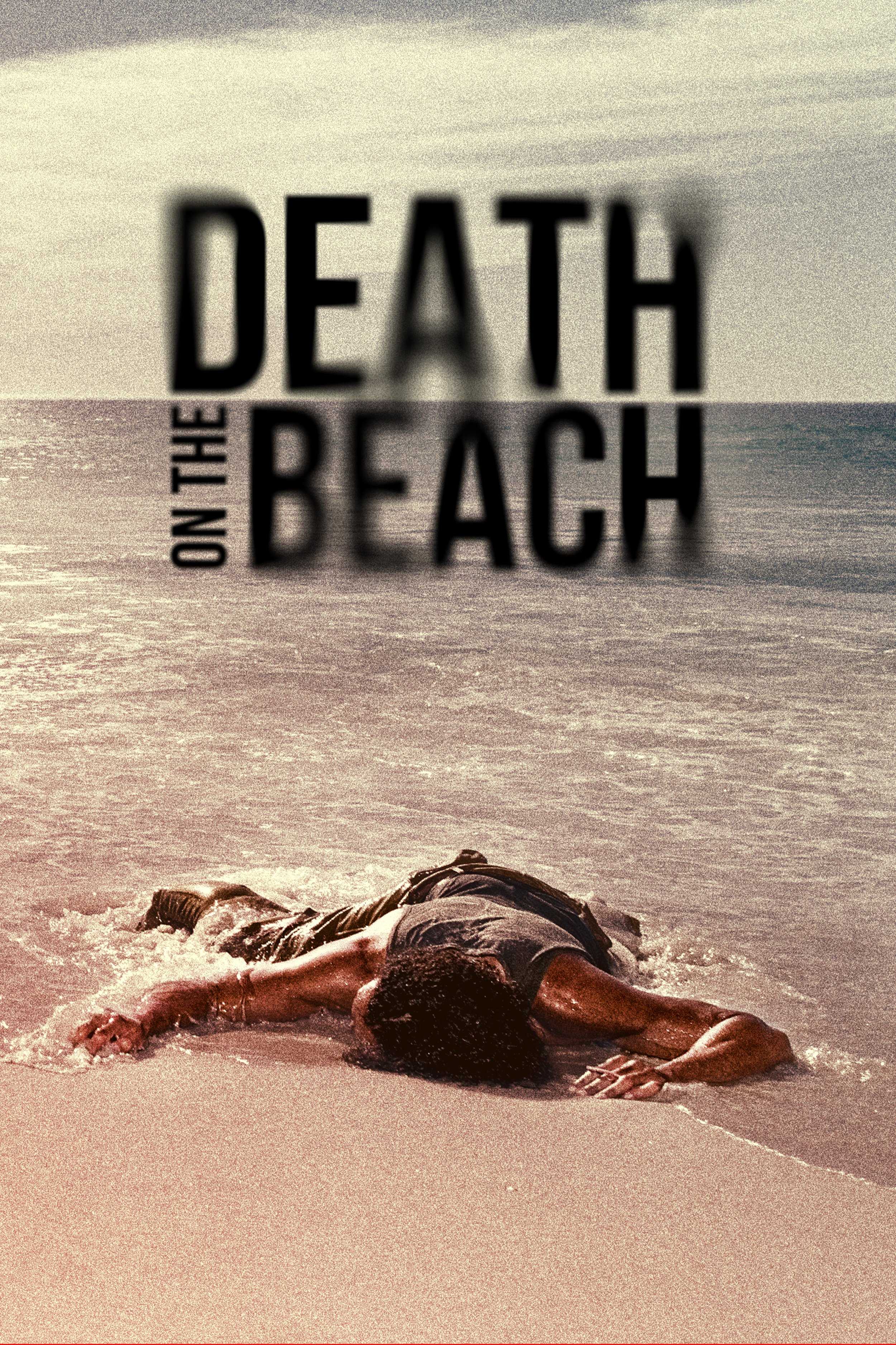
art direction for key art
As a design manager for discovery+, I was responsible to help our designers create immersive and compelling key art for the platform. In these examples, the original artwork has the logo with the big white brackets. I worked with each designer to concept, visualize and finish each key art piece.
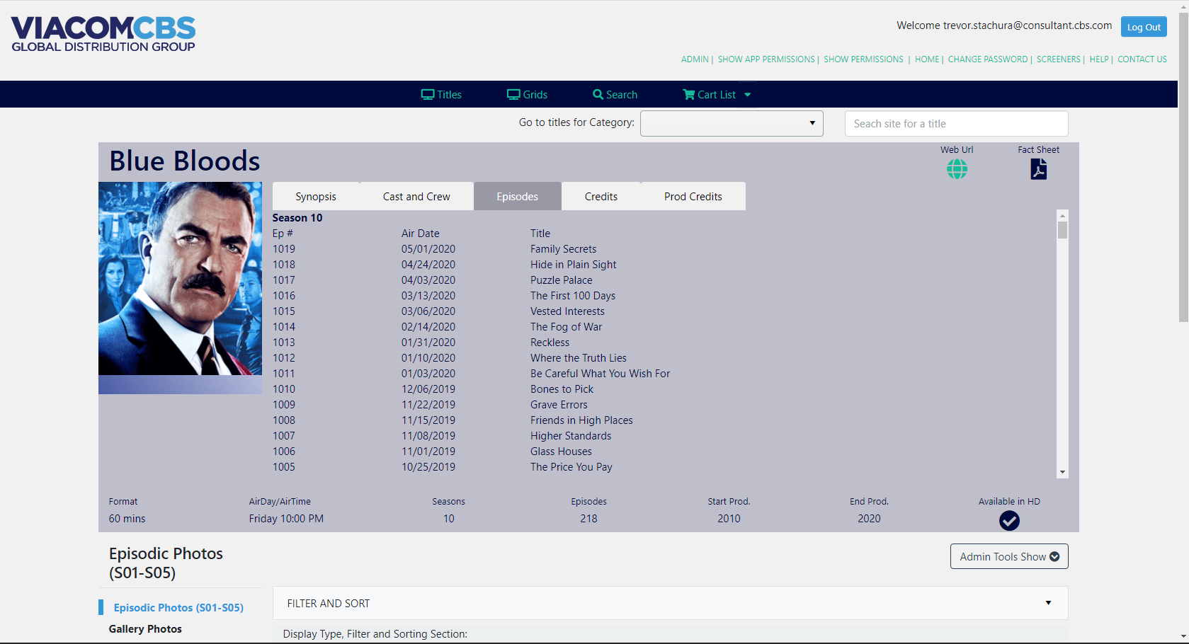
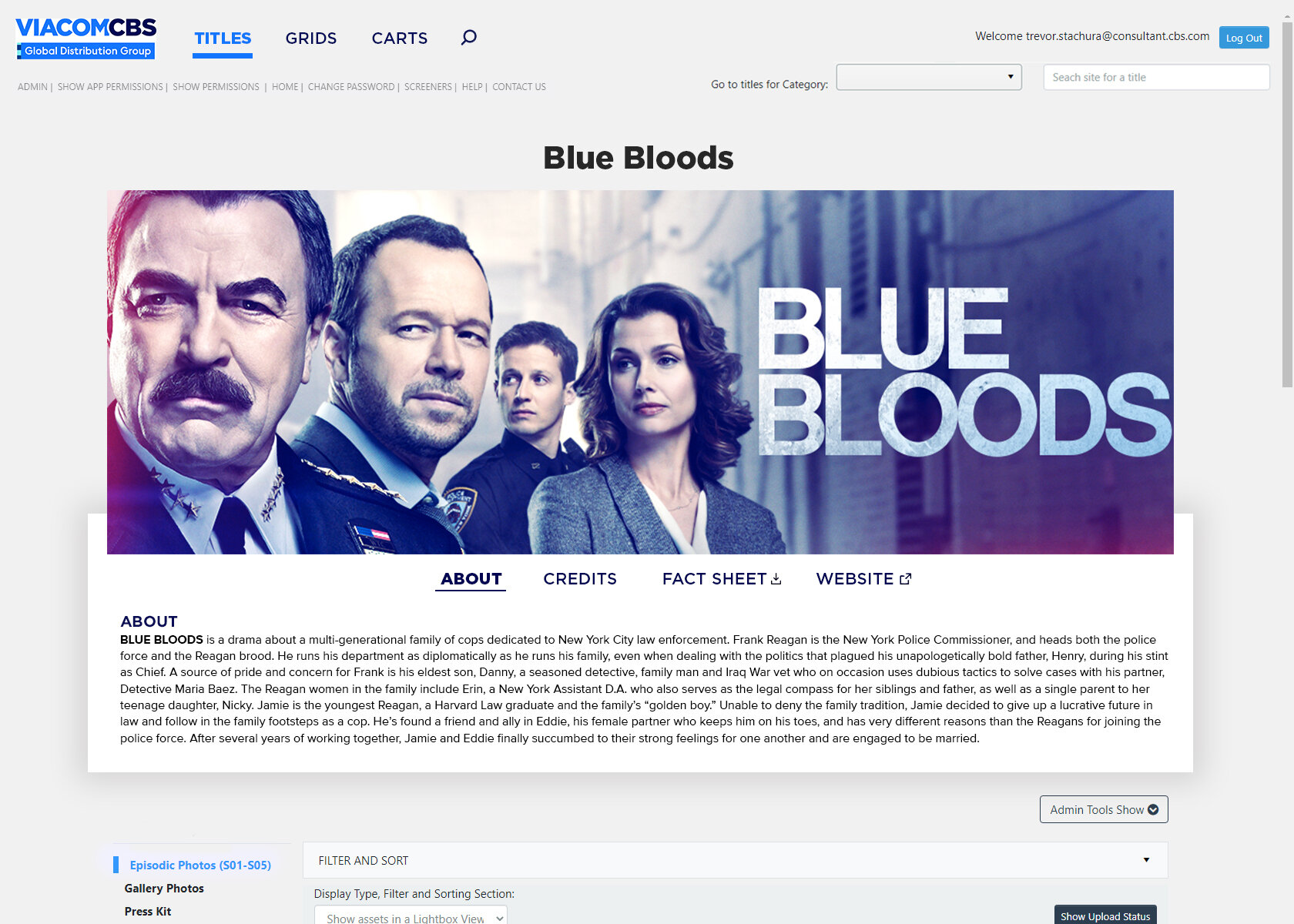
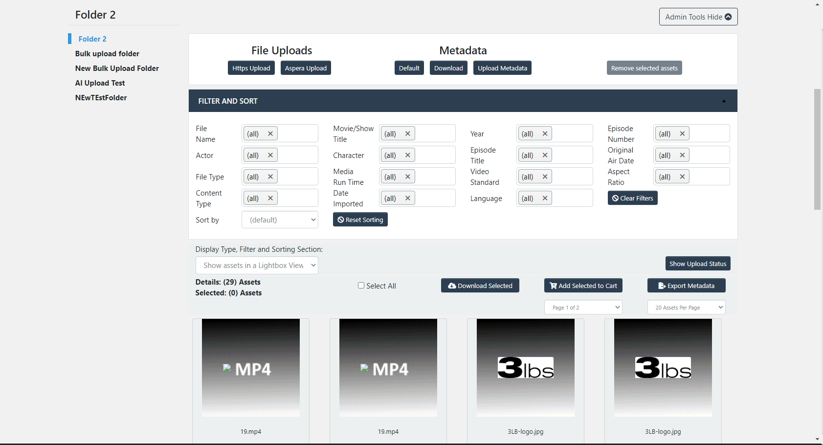
Global Distribution servicing website and iPad app re-design
The website team came to me for direction on updating the CSS styling of the website build they were working on. After many versions, here are a couple of screenshots of the before and after pages. My goal was to remove any unnecessary information, streamline the information and make it easy to navigate. I didn’t do any HTML coding on this project - Only UX/UI design direction.